
Commerce online, to a large extent, is dictated by how everything about it is being displayed. Every merchant, having a store online today knows, how important it is to have products and categories displayed systematically across the store. More important, is how all of the visual information is hooked together to enable buyers through, to the most profitable section of the store and induce a buying need.
WooCommerce Category banners are adept in doing this part. Made beautifully, designed strategically, and placed on the right banner holder at the right time, category banners can offer an amazing experience to prospects and buyers while making a profitable contribution to the seller’s pockets.
The catch is, how you define beauty, strategy, place, and time while you are dealing with category banners. It looks a fairly simple thing to do, but is quite the contrary.
Let’s break a few myths here, know about some more, and enter serious realizations when it comes to category banners.
Why have them at all???
Right, why? When you can have beautiful images of each product right there on the top of the page, why have brains lent behind on something as intermediate as categories? I mean people buy products, right? They don’t buy categories.
Here are 5 good reasons why
- It serves as a parking stair where your visitors can park for a bit to scan through all the amazing products that are there in that category. Having a strategically made banner here, helps. It’s your chance to showcase your best products and quite obviously, the highest paying ones, in the best manner possible.
- Category banners are an opportunity to lead your customers to specific products. Research shows that prospects, once introduced to a particular product picture seek the product in the product list. Not finding it, leads to frustration and finally, abandonment of engagement. Hence the need to produce product pictures on category banners and then link them internally to the products that they are showcasing.
- When you are running offers and campaigns, nothing beats the power of a category banner. Make it big and loud just there on your banner and expect it to work wonders.
- Category banners are a good way to induce impulse purchases. Never miss on its potential.
- New arrivals and clearance ranges sell well when it mentioned right there on the category banners.
Ok, so how do you make them effective?
Strategically thought content placement coupled with visual appeal is the key.
Banners need to be really effective, with relation to what is the message that is being displayed, how it is being placed in relation with the pictures that are being displayed, and where on the page, the banner is being displayed. By default, plugins, and themes offer top-aligned place holder for category banners.
However, following the convention is not always necessary. Flowing with the norm does help with a secure air, but not always.
Research proves that most web visitors scan pages and documents in an F pattern or a T pattern. That of course makes the top alignment the safest bet. But depending on the alignment of images, the content skeleton around, and the products involved – you might want to toy around a bit with where you want to place your category banner.
You might want to get inspired from a few fantastic examples too!
Apparel stores for example, that want to sell of a new arrival of summer collection, generally put up photoshopped pictures of models, sporting a few clothes of the collection. Many of them make a mix and match collage of 4-5 such pictures and present it in the banner place-holder.
Such brands can instead, showcase just one model walking in one of the dresses on a side aligned vertical banner. It is sure to be catchier, more appealing and probably more contributing to the genre of apparel that was being displayed.
How should category banners be looking like?
Very ideally, clean. One photo with one message or call to action should be enough. Cluttering only confuses your visitor and distracts them. A lot of extremely good-looking images with an important action-point that gets neglected in light of the image’s own aura, is a really bad choice. It distracts your visitor and gets him lost in all the glamour and then continuing with the website without knowing what to do…or worse, just quit.

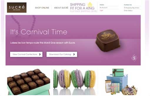
This is an example of a category banner done absolutely right for a festive offer – just one plain picture with 2 simple, non-elaborative action points for the visitor to relate to. Beauty does not necessarily mean gorgeousness. It means an appropriate communicative delivery of visual emotions to the right audience in the right proportion. And that can be done just with a precise blend of color, effect, image, and copy.
How frequently would you want to change your category banner?
While there is no rule of thumb regarding this matter, well, you might want to change it frequently enough to keep your products in memory of your buyers. Every new arrival has to have a special place. Festivities and seasons are important occasions to change your category banners too. Utility-based category picturization is also crucial and that needs to be changed according to push sale requirement.
The aim of changing category banners should not be to showcase products. It has to aim towards getting your visitors pick out what they want, easily, notice offers and discounts and make impulse purchases.
Do you need to manage your category banners?
Oh! Yes! A definite yes! On the face, it seems as simple as creating a banner and uploading it in your banner space holder whenever you want! But multiply this by the number of categories that you are dealing with and the number of times you mean to change the banner images, and you will know what kind of monstrous task burden that is. And that’s exactly why you need to have something at your disposal that manages your category banners.
WooCommerce as such, does not offer any such facility. If you need something really helpful, you will be needing a plugin that helps you with managing your category banners. There are a lot of them, both free and paid. Look out for the one that best fits your store and sale nature.
Alright! So that’s it. With all this at hand, I am guessing, you will be equipped enough to make an impact with your category banners
Do you want to add the single banners and Multiple banners for pages and categories in WooCommerce stores?
Check out our new plugin!
WooCommerce Banner Management Plugin
Manage page and category-specific banners on your WooCommerce store to promote products or offer. Set banners/sliders on any page, category, shop, cart-page, checkout, thank you, and welcome pages.
4000+ Active Installations
8200+ Active Premium Customer


