
Flour to your bread, shoes to your feet, attire to your occasion, theme to your website — we have seen the disasters, the wrong ones bring. And we have seen the magic of the right ones too!
Time to bring the chant of the magic part to you.
Choosing a theme for your website is possibly the most ignored part of the whole process. Some “marketing officers” of your team would sit down together with mugs of coffee warming their palms, scratching their scalps, scribble down a few known names in the address bar of the browser….land up on something like Theme Forest….and that’s it!
Half an hour of searching here and there would bring up the base skeleton, your website would lay its body on, for the next couple of years, at least.
Half an hour of lazy brain-storming for scores of potential leads that would keep your bank accounts juiced up for the next couple of years….at least.
That’s recipe for a well-invited cream smothered disaster.
Here is a well-tried and tested check-list for that team of “marketing officers”, with those mugs of coffee snuggling against their palms — A checklist for ensuring that your website performs optimally for your visitors to stay happy and jump the thin line between a prospect and a client.
1. Hey, wait! Why do you need a theme at all?
That’s the easiest and quickest way of all! Of course!
Yes! And we can never be obliged enough for the amazing plug-ins that WordPress offers. Themes built in WordPress, generally come enriched heavily with these plug-ins.
Every day, designers and developers come up with amazing templates and themes for businesses that don’t have the bandwidth of putting up a custom website.
Let’s not forget the security too!
Given all this, it is easy to get swayed away by the idea of quickly purchasing a WordPress theme.
But that’s not always the best you can do! Your website or any web thing for that matter has to be displayed in a frame, that helps you meet your goals.
A brilliant theme come with amazing features…..but it comes for everybody, who download it. Chances are, the top selling themes have already been downloaded thousands of time. Even after customizations, it’s obvious, your website would represent another one that used the same theme.
Besides, there are these unnecessary lines of codes, that your website would never be using…they would only increase your website’s loading time.
A custom built website, in many cases, holds a stronger position. It’s flexible, it’s scalable and most importantly, it has been built right there, under your nose. You know it inside out, and you have complete control over it.
If you have the time and resources to to put together your website from scratch, go for it. Home-made is tiring, but it’s generally accurate to your requirements.
2. If a theme is what you decided on, which kind should it be?
A single pager? A multi-usage one? Something with a page builder? Something that offers specific plug-ins, as freebies? Something that solves a specific purpose? (an online shop, for example?)
For deciding on things like this, you need a clear picture about your goals, your audience and the core message that you want to communicate to them.
We have met people who want everything to be there everywhere on their website. When we ask them, what is the message that you wish your visitors should register, they would come up with a bland list of monotonous services.
Thing is, they are so sure about this part, moreso, so enthusiastic about it, they almost get offended when we say…. ‘No! this can’t be the message!’
3. This brings us to messages that themes, in their own capacities, speak loud
It’s important to understand here, that these ready-to-use these are built by designers, who put in their own individuality into their work. As such, every theme has its own personality. Some are quirky, some are elegant, some are loud, yet others are subtle.
Choosing a theme that matches your business message in its personality is the best thing you can do. That way, you save yourself the major work of tweaking the personality of the theme. (That is really challenging and most developers goof this part up)
4. Did you map your to-be website yet?
That’s right! The obvious tendency is to choose a theme and then fit content in blocks. Get all boxed up! That sounds to me somewhat like picking up jeans pants from a store without trying them on. You pick one up….you bring it home..you tries it on. If it clings to your skin with dear love, you say you will lose weight to get it fit right. If it falls loose, you say you would keep it for fatter days….Unlucky you, useless pants.
If you don’t map your website before your even start looking for a theme, it would be a twin situation of looking for a jeans pant before knowing your size.
That gives you a useless theme.
What we mean by mapping is — you have to have your information architecture ready at hand, a rough wireframe in your mind and a clear idea of what you need (not what you want)…..
…..eg….. We have worked with startups who want a fabulous website to begin with. They are usually bubbling with ideas, people with strong voices and confident about their approach. Many would have already scanned through the best websites of the world and pretty much have their expectations set up at good heights.
When we interview them, we find out, a lot of information to be displayed, is being repeated in different forms in different sections of the theme they pointed out. When asked why they say…they are utilizing space wisely.
We call it useless reiteration. After crossing out and ticking in points of the interview, we arrive at the conclusion, a one-pager would solve their purpose…while what they had chosen was a 5 pager.
A lot of times, the situation is contrary to.
5. Not a custom one, fine! But will a drag and drop be better than ready-to-use fixed design format?
Most themes you find, will have pre-written lines of codes. Tempering with these codes often land people in soup. Possibilities of making major alterations to the existing frame, become far-fetched and any effort to do so, bring about lowering of display quality.
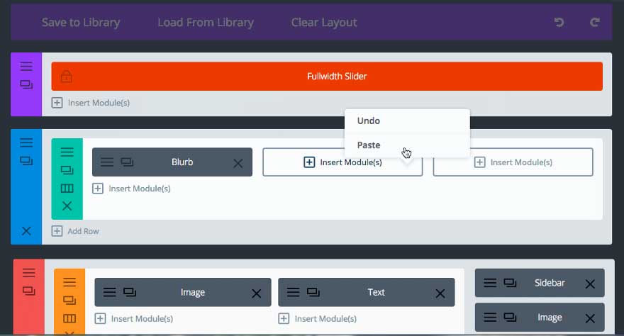
But there are themes like Divi and Nitro, that come inbuilt with fabulous drag and drop page builders.
That means, even if you do not have a pro programmer on your team, you can still handle the situation and get a website just the way you want it, in very less time.

Many page-builders, nowadays, come with Visual Composer too. It is a paid plug-in in itself, but comes in a bundle with selected drag and drop templates.
Does the theme, that you have chosen, enable you with the strength of an easy to use page builder?
6. Is it optimized for Search Engines?
Search Engine Optimization is a huge huge thing — it starts with how you plan your website and spans activities way beyond content production.
Most themes would say, they are SEO friendly. How true is that?
Here are 3 important questions that you need to ask yourself, while you shuffle through live previews of themes:
How quickly are they loading?
How dense is the internal linking?(and are those links valid?)
How many elements are being used on the pages? (The larger this is, more cluttered is the page, and weaker is the SEO fit)
WordPress themes are mostly made by designers and developers, who might, or might not have an in-depth knowledge about the latest SEO guidelines.
As such, you might devote some time to this aspect.
7. Clean and simple? Minimalist? Or element rich?
We suggest — choose it clean. The more cluttered it is, the heavier will it be, and the slower will it load. You want none of that to happen.
Having a lot of things on your website does not help.
It is best to have the bare necessities displayed in an elegant, clear manner. The more the white space, the smoother is the user’s experience. A lot of things tend to distract visitors and drive them out of your website.
Pull of the idea of an unnecessary carousal, give up on high quality stock photos when they are not needed, cut down on the number of sections to reduce scrolls, try and have a very clear navigation…..in short, don’t do anything that leaves your visitors guessing what to do next.
That does not have to make your website look aesthetically unappealing.
Quite the contrary. Simple websites are scientifically better. It is a proven online behaviour that people envision what they are expecting to see. Any major
deviation from that would be a disaster, even if feels wonderfully creative and are aesthetically fulfilling to everybody on your team.
8. The color palette?
One mistake that most people make while choosing a theme, is, they think they will tweak the colours later in. So they choose a theme with a colour palette ‘x’, because they like other things about this theme. and then when they are done with deciding on the intended branding, they set on changing the theme’s colour palette.
And disaster dawns.
If you are really not sure about what your brand’s color palette should be, we recommend, go neutral.
White’s are evergreens. White means space, white means de-cluttering….and the proper use of white can offer the intended emotion to your brand — be it quirk, be it elegance.
9. Did you check the technicalities?
Bloated codes that don’t make sense to you, bugs here and there, heavy and scattered CSS files, useless elements here and there….there are a lot of things that are potential snails to your website.
Any sort of heavy file brings down the website’s speed. And that is really bad for you and your visitors.
Perform a quick Pingdom test to ensure, your theme is technically sound.
10. Responsive? Cross browser compatible?
Device friendliness comes primary nowadays. Is your theme supported on all sorts of screen sizes? By that, we don’t mean a plain rearrangement of content and media.
What we mean is, are you allowed to add, remove and rearrange elements? Are you allowed to tweak column sizes….or maybe add an additional column to make your larger screen look fuller?
Nitro is an example of such a theme. It allows e-commerce to be completely personalised for devices.
11. Will it help you talk to your visitors?
Is its style conversational?
Does it allow you to be in flow, yet convey 5 different emotions at the same time?
Themes have to present a conversational style. They have to allow you, strike a really deep chord with your visitor through a balanced use of copy flow, media, colours and typography.
And if you are thinking that is your designer’s sole job, well it is….but the theme you choose will decide hugely on the perfection of this job.
12. Are you open to tests and trials?
Most themes would allow you an admin demo. (If it does not, trust us, you don’t want to go for it)
It is always better to have the basic few pages of your website, set up on a few templates before finalizing one from them.
Yes, it is a lot of work…but doing a lot of work is better than giving yourself a facepalm later on.
Most importantly, trying 5–6 themes before choosing one can help your idea of your website evolve into a clearer picture.
13. Heard about the 30 sec elevator pitch?
Yeah…so here is the cool thing about it — anybody (even a fatass Dumbo) is supposed to get whatever crap you are pitching, in just 30 secs. It has to be that simple.
So after you have tried setting up a couple of pages on a few themes, the next thing you must do is, show all this stuff to people that you know. They will tell you, which one strikes best and the quickest.
Go for the one that wins maximum votes.
14. Free or premium?
We all grow up believing, everything that is good and valuable, has to cost a fortune. Or the other way round, if does not make your pockets cringe a bit, may be, it is not really the best you could have.
Well, we say, your theme does not have to make your pocket cringe. But it is wiser to go for something that makes you pay for its value.
Though there are awesome free WordPress themes out there, it is not the safest bet to go for them. Reasons range from malicious code to lack of support. Hidden advertisements are scary.
Premium themes come safe of such complications. Some premium themes are one-time purchases, others demand a certain sum to be paid every year.
15. Is that premium theme worth the price?
You will come across themes that would cost you anything between $15 to $150. How do you find which one is worth?
Look for these 6 things —
The reviews and rating
Comments on forums and response of the support team
Features and add-ons that come inbuilt with the theme (page builders for an example)
Bundled plug-ins (Nitro, for example, gives bundled plug-ins worth much more than what you are paying for)
Ease of use, considering your team is bloated with tech dumbos (tech nerds would anyways take you a lot higher than a ready-made theme, right?)
Cleanliness of codes (any programmer on your team would be able to guide you on this)
If you got these 6 things right, you basically got all of it right.
16. Last, before you click on the ‘Buy’ button
How strong is the developer’s support? Does the theme come with a documentation that you can refer to?
Your in-house developer might take part in making little twists and tweaks here and there….But with most good themes, comes a great promise of support.
Check the strength of the theme’s customer support people on forums and communities before you proceed to finally buy it up.


