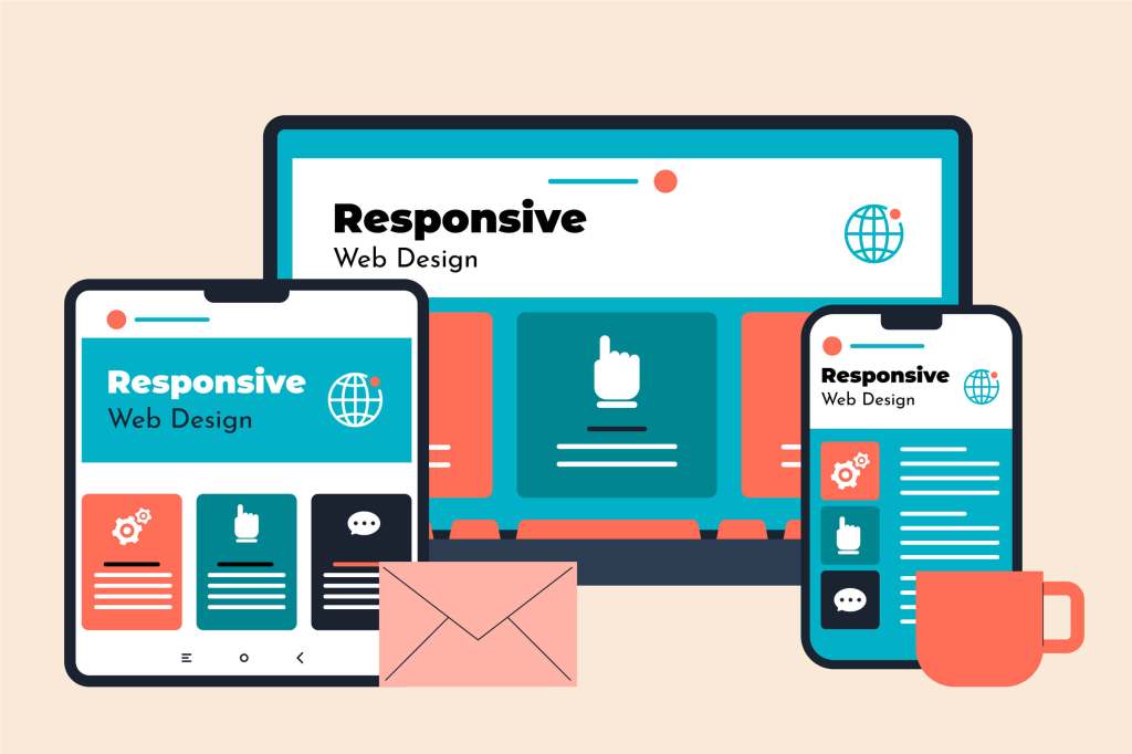
What is Responsive Design?
Responsive design is a web design and development approach that makes websites work well on a range of devices and screen sizes. This approach aims to create a seamless and fluid user experience, regardless of how a user accesses a site. Rather than designing multiple sites for different devices, responsive design uses flexible grids, layouts, images, and CSS media queries to adjust the content dynamically.
Key Features of Responsive Design
Responsive design incorporates several essential principles to ensure adaptability:
- Fluid Grids: Elements are sized in relative units like percentages, rather than absolute units like pixels, to ensure they resize relative to their container.
- Flexible Images: Images and media adjust to fit within their containing elements, using techniques like CSS max-width properties.
- Media Queries: CSS media queries allow the application of different styles for different device characteristics, such as screen width, height, and orientation.
The Importance of Responsive Design
Responsive design is crucial for several reasons:
- Improved User Experience: Users have a smoother and more enjoyable experience, as the design adjusts to their device, making navigation and content consumption easier.
- Increased Mobile Traffic: With the rise of mobile internet usage, responsive design ensures that websites are accessible and functional across all devices.
- Better SEO: Search engines, like Google, prioritize mobile-friendly websites. Responsive design can improve search engine ranking by offering a better user experience on mobile devices.
- Cost Efficiency: Maintaining a single responsive website is more cost-effective than creating and managing separate versions for different devices.
- Future-Proofing: Responsive design prepares websites for future devices and screen sizes, reducing the need for frequent redesigns.
The Principles of Responsive Design
Responsive design principles guide the creation of flexible and adaptive web layouts:
Fluid Grid Layouts
Fluid grids divide the web page into columns, and the elements within these columns resize proportionally, based on the screen size. This approach allows the layout to be flexible and adaptable.
Flexible Images and Media
Using CSS properties like max-width, images and media can scale within their parent container, ensuring they don't overflow or distort regardless of the screen size.
Media Queries
Media queries in CSS enable the application of different styles based on the characteristics of the user's device. For example, a media query can detect the screen width and apply specific styles for mobile devices:
@media (max-width: 600px) { .container { width: 100%; padding: 10px; }}Responsive Typography
Typography must also be adaptable. Relative units like ems or rems can be used for font sizes to scale text proportionally within the layout.
The Process of Implementing Responsive Design
The implementation of responsive design typically involves several key stages:
Content Strategy
Start with a content-first approach, designing the website layout around the most important content and ensuring it has maximum impact on all devices.
Fluid Layout Creation
Develop fluid grid layouts that automatically adjust based on the screen size. This ensures the content remains readable and usable across devices.
Implement Media Queries
Write CSS media queries to handle different styles for various devices. Test these queries thoroughly to ensure the styles apply correctly across a range of devices and screen sizes.
Test on Real Devices
To ensure the design performs well across all platforms, test the website on real devices. Emulators and browser developer tools can assist, but real-world testing on actual devices is critical for identifying and resolving issues.
Iterate and Optimize
Responsive design is an iterative process. Continuously gather feedback and usage data to optimize the design and address any emerging issues.
Tools for Responsive Design
Several tools can aid in creating and testing responsive designs:
- Bootstrap: A popular front-end framework that includes a responsive grid system, pre-styled components, and utility classes.
- Foundation: Another robust front-end framework providing responsive grids, components, and a flexible base for responsive design.
- Chrome Developer Tools: Offers powerful emulation features to test how a website performs on different devices and screen sizes.
- Adobe XD and Figma: Design tools that allow for creating responsive layouts and prototyping across different viewports.
Best Practices for Responsive Design
To ensure effective and efficient responsive design, follow these best practices:
- Mobile First Approach: Start designing for the smallest screen and work your way up. This approach prioritizes the most critical content and ensures it looks good on all devices.
- Prioritize Performance: Optimize images, minify CSS and JavaScript, and reduce HTTP requests to ensure the website loads quickly on all devices.
- Use Breakpoints Thoughtfully: Apply breakpoints at points where the design starts to break, rather than at specific device dimensions.
- Consistent Navigation: Ensure navigation is intuitive and accessible across all devices. Implement touch-friendly elements for smaller screens.
- Responsive Media: Ensure all media elements, including videos and images, are responsive and load appropriately on different devices.
Conclusion
Responsive design is essential in today’s digital landscape, where users access content on an ever-growing variety of devices. By creating adaptive layouts, designers and developers can ensure an optimal user experience across all platforms. Implementing responsive design not only improves usability and accessibility but also enhances SEO and streamlines project maintenance.