How to Develop Custom Gutenberg Blocks for WordPress: A Step-by-Step Guide
Everything you need to know about developing powerful, reusable, functional Gutenberg blocks for your website.
Table of Contents
Building custom Gutenberg blocks in WordPress opens up new possibilities for enhancing your site’s functionality and design. However, getting started with custom Gutenberg block development can feel challenging, especially if you're new to it. But with the right guidance, it's easier than you think!
We'll walk you through the basics of creating custom blocks for WordPress, from setting up your development environment and writing your first lines of block code to debugging and more.
Whether you're a seasoned developer or just starting, this tutorial will give you the tools to harness the block editor's full potential and create unique, reusable elements for your site.
Let’s dive in!
What is a Gutenberg Block?
Gutenberg, or the block editor, is the modern replacement for the classic WordPress editor. While it’s still under development, it has matured enough to be the default editor in the latest WordPress versions.
WordPress Classic vs. Block editor
You can add blocks in the block editor to insert various types of content on your site, such as headings, paragraphs, images, galleries, etc. These essential blocks are known as core blocks and are built-in, so you can use them straight away.
WordPress sites made with the block editor (Source: WordPress Enterprise)
Unlike the classic WordPress editor, Gutenberg blocks are built with JavaScript and React. The block content is still stored in the WordPress database’s wp_posts table. However, WordPress inserts HTML comments enclosed within <!-- and --> tags to delineate blocks and provide additional information to render them.
How WordPress delineates blocks with HTML comments
The example above highlights how WordPress uses these HTML comments to define and store blocks. Note the JSON literals inside the comment. They are the block attributes. You’ll learn more about them later when you build your first custom block.
The above code is rendered as the below image in the block editor and the site frontend. In this tutorial, you’ll learn to create this very call-to-action block:
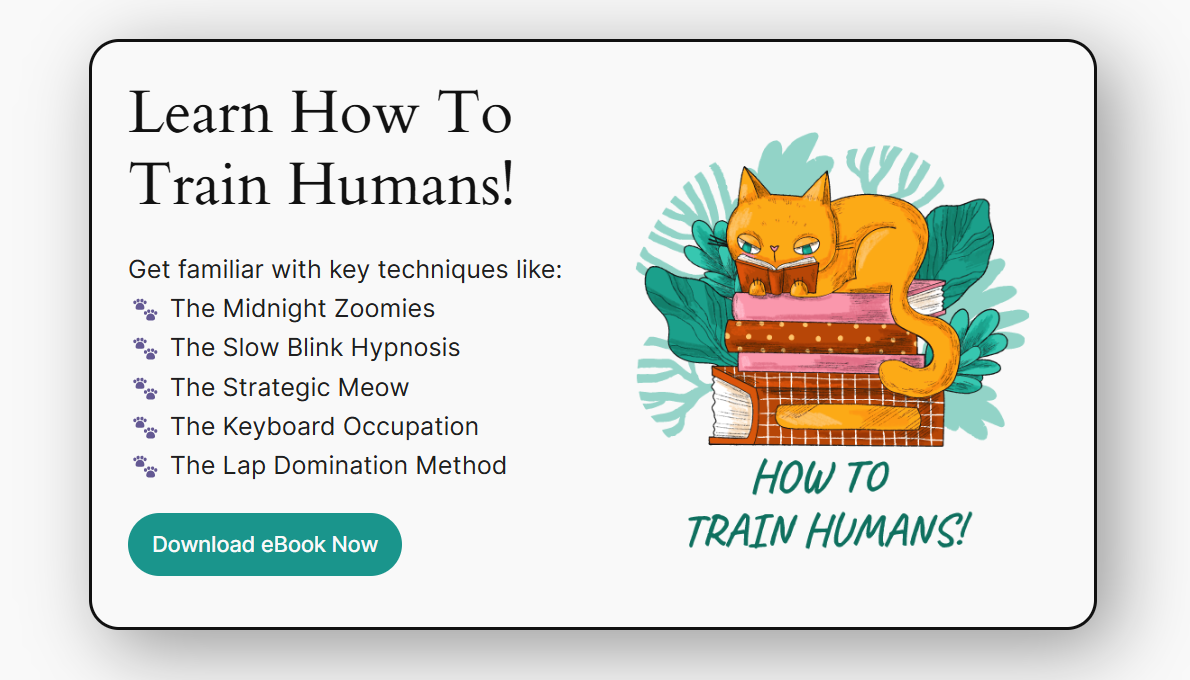
The CTA block you’ll learn to develop in this tutorial
Block Development Prerequisites
To follow this tutorial, you should have a specific development environment setup and be familiar with some concepts of WordPress and web development. Here’s a quick list of them:
- Block development environment: You need a local WordPress environment, a code editor, node/npm, and a terminal application for your OS to get started. We’ll get you up to speed on this in the next section.
- PHP and WordPress plugin development: Some basic knowledge of PHP and WordPress plugin development is helpful.
- Familiarity with web development basics: HTML, CSS, and JavaScript skills, including React.
Setting Up Your Block Development Environment
Before starting, you must set up your block development environment. There’s not a lot to it, you just need these four things:
- A local WordPress environment: This gives you a controlled environment to build and test your code before deploying it in production. It’s also much faster. The Block Editor Handbook recommends using wp-env with Docker, but you can also use MAMP/WAMP/XAMPP or Laragon. Spin up a new local WordPress site to use for this tutorial.
- A code editor: Here’s where you’ll write the code, so any code editor would do. We recommend Visual Studio Code (VS Code).
- A terminal application: To interact with your OS to run commands. The default terminal application is simply called the Terminal on macOS and Linux distributions. It’s called the Command Prompt on Windows, but we recommend using PowerShell, which is preinstalled on all modern Windows systems.
- Node.js/npm with nvm: Node.js is a runtime environment that lets you execute JavaScript code outside the browser. Installing Node.js also sets up the Node Package Manager (npm). We recommend using Node Version Manager (nvm) to install and manage your Node.js installations, as it makes it easy to switch between different Node.js versions. To set everything up, you can use the free utility nvm-windows.
Once you have these four requisites, you have all you need to begin your block development journey.
Creating Your First Custom Block
At its core, a Block is a JSON object with a set of properties. You can register this object anywhere in your WordPress code, but it’s best practice to register it with a plugin.
While you can create all the files to create your block manually, it’s a chore to do so every time. Thankfully, there’s a much easier way to do it—the create-block tool. It’s also the official recommended way.
This tool generates the required PHP, JS, and CSS code to register your block and includes a modern build setup to facilitate development.
First, go to your local WordPress site’s plugins folder in your terminal, and then run the following command to scaffold your block plugin. In this tutorial, we’ll first create a simple call-to-action (CTA) block, so we’ll name it accordingly. You can use it for marketing pages, product promotions, or sign-ups.
npx @wordpress/create-block@latest multidots-ctaFeel free to use any block name you wish!
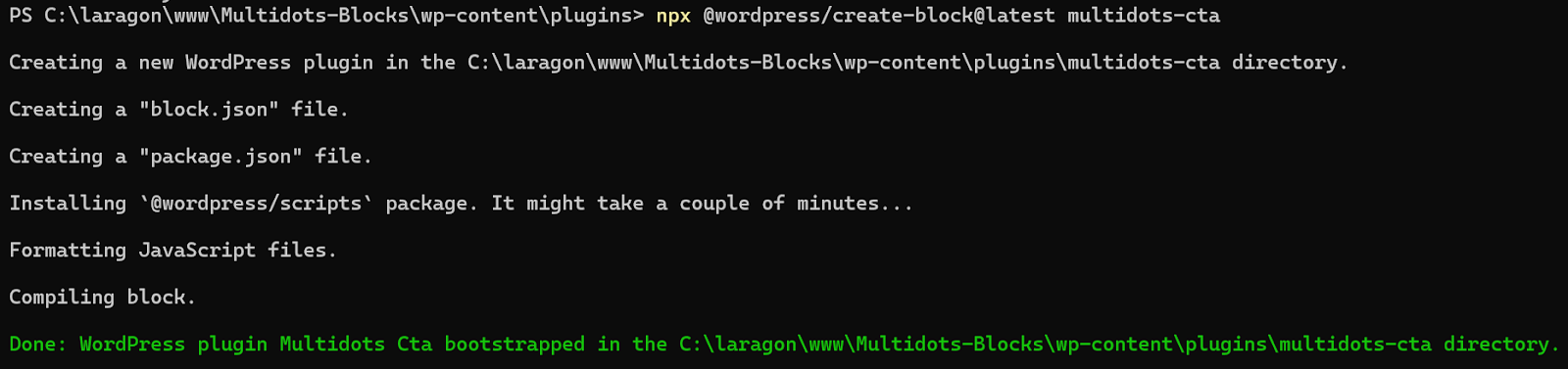
Using the create-block tool to scaffold a block
It’s an interactive command prompt, so you’ll have to provide input if it asks for it. You may encounter some deprecated warnings, but that’s okay. Creating and compiling the block files may take a few minutes.
The command above follows this structure:
npx @wordpress/create-block [options] [slug] We haven’t provided any options in the code above, and the slug is multidots-cta. The slug defines multiple things at once:
- It’s the block name.
- It’s also the name of the directory where all the block plugin files are generated.
- It’s also the name of the block plugin.
To continue working inside this folder, you can use the cd command to change the working directory to the plugin folder.
cd multidots-ctaHere, you can view all the files generated by the create-block tool. Understanding the structure of these files is critical to block development.
Note: To learn more about the create-block tool, check out the official Using the create-block Tool tutorial or refer to the Block Editor handbook.
File Structure of a WordPress Block
Open the call-to-action folder in your code editor to see the block plugin’s file structure. There are many files and directories within this folder, but these are the critical ones:
custom-block/
│── build/
│── src/
│   ├── edit.js
│   ├── save.js
│   ├── index.js
│   ├── editor.scss
│   ├── style.scss
│── block.json
│── package.json
│── custom-block.php
If you’re using VS Code (highly recommended again), this is how the block plugin structure will appear in the explorer:
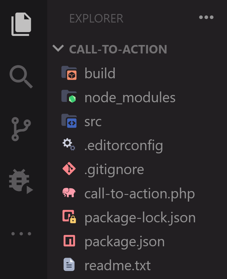
Files and directories of a block plugin
Firstly, there are three folders:
- build: Here’s where the block’s final deployable code rests. The build process will generate this code automatically, so you don’t have to touch anything in this directory.
- node_modules: In this directory, you’ll find all the node modules and scripts necessary for the build process. You don’t have to worry about looking into this folder either, as it’s already taken care of by the create-block tool.
- src: Your main work directory for block development. This is where you’ll develop and define the core functions of your block. It contains multiple files, and we’ll cover them in detail in a later section.
Next to those folders, you’ll find many files:
- .editorconfig: Defines coding standards for WordPress projects, regardless of which IDE or code editor you use to work on your project.
- .gitignore: Specifies which files and directories should be ignored by Git when committing. It includes files such as logs, caches, and the sensitive
.envvariable file. - <plugin-slug>.php: This is the default PHP file to install a WordPress plugin. If you’ve created or modified a WordPress plugin, you should be familiar with this file. It contains the
register_block_type()function to register the block. The block details are extracted from the metadata stored in the block.json file in the src folder. - package.json: This is a standard NPM file for defining dependencies and scripts. It contains all the
node_modulesand scripts (wp-scripts) for local development. You can run these scripts in your terminal application. - package-lock.json: Defines the exact version of all dependencies and scripts, so that even if some of them get updated later, you or anyone else can reproduce the original tree later.
- readme.txt: The default readme file used for publishing plugins to the WordPress Plugins Directory. It’ll come in handy if you plan to publish or distribute your plugin later.
Now, let’s see the src folder’s contents in detail:
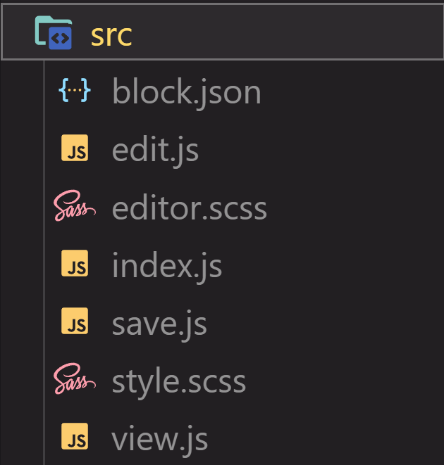
The src folder files
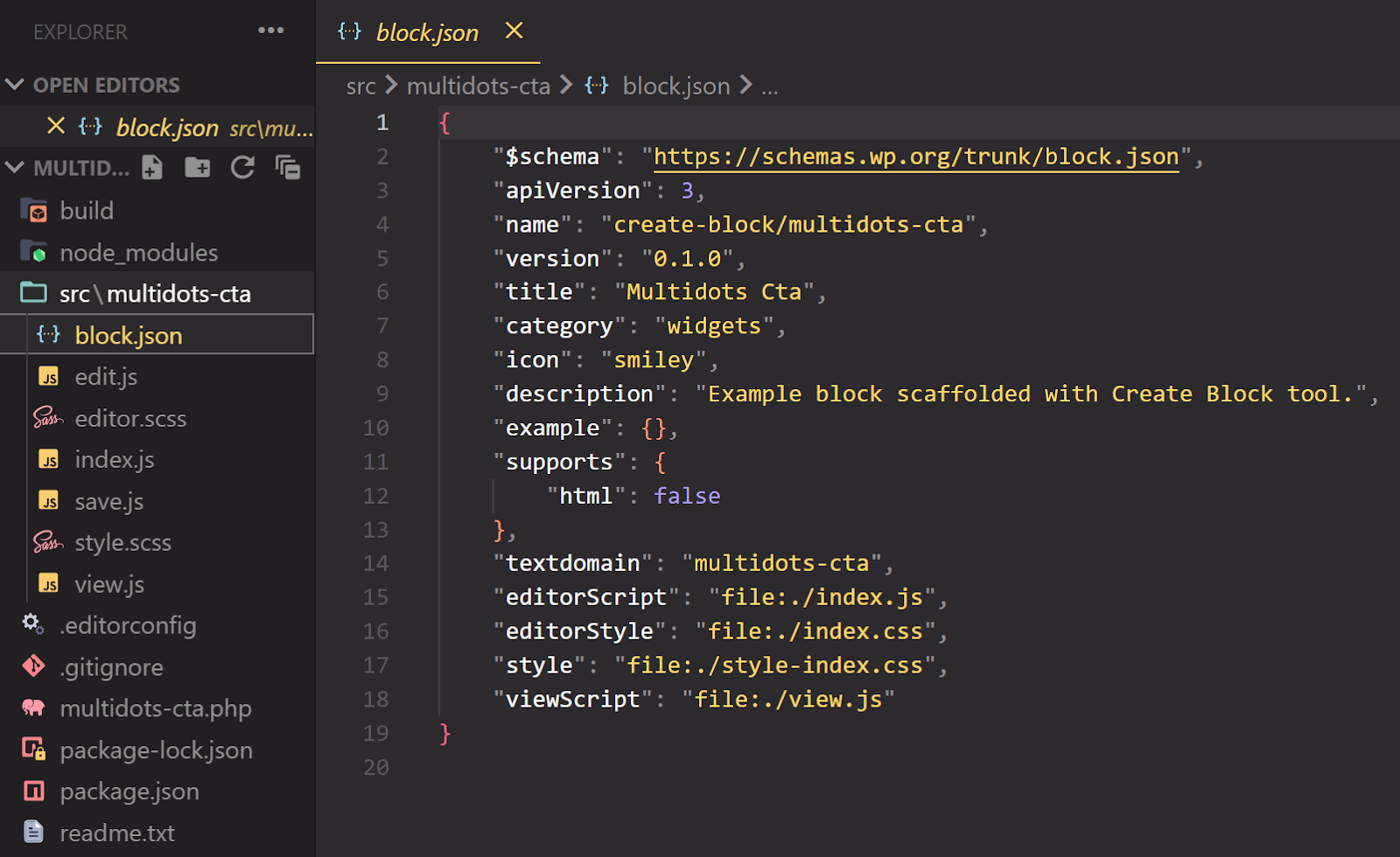
- block.json: This file stores the metadata used to register the block, like its name, version, title, category, icon, description, etc. Here, you can also define the block attributes as key-value pairs, provide alternative block stylers, and define the block's options in the editor. The default
block.jsonfile generated by the create-block tool looks like this:
{
"$schema": "https://schemas.wp.org/trunk/block.json",
"apiVersion": 3,
"name": "create-block/multidots-cta",
"version": "0.1.0",
"title": "Multidots Cta",
"category": "design",
"icon": "widgets",
"description": "Example block scaffolded with create-block tool.",
"example": {},
"supports": {
"html": false
},
"textdomain": "multidots-cta",
"editorScript": "file:./index.js",
"editorStyle": "file:./index.css",
"style": "file:./style-index.css",
"viewScript": "file:./view.js"
}
We’ll explore working with this file later.
Note: In a .json file, the last property doesn’t end with a trailing comma, unlike with JavaScript code. The terminal will throw an error during the build process if you have a trailing comma in any JSON file.
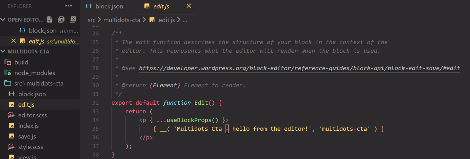
- edit.js: This JS file exports a React component called
Edit(), which explains the capitalization. It determines how the block renders and functions in the editor. The block markup and what controls it shows in the editor’s Inspector Panel are all defined here. The function here takes the attributes defined in theblock.jsonfile as its parameters. You’ll primarily work in this file during block development.
Below, you’ll find the default edit.js code generated by the create-block tool. The comments have been removed for easier reading.
import { __ } from '@wordpress/i18n';
import { useBlockProps } from '@wordpress/block-editor';
import './editor.scss';

export default function Edit() {
return (
<p {...useBlockProps()}>
{__('Multidots Cta - hello from the editor!', 'multidots-cta')}
</p>
);
}
Notice the three import statements. The first one imports the i18n library necessary for translating or internationalizing the block plugin. The second import statement loads the useBlockProps React hook from the @wordpress/block-editor package, and the third loads the internal edit.scss file.
It then exports the Edit() function, which uses a <p> wrapper element with the useBlockProps React hook.
- editor.scss: This CSS file styles the block’s appearance in the block editor. Typically, you’ll want the block to appear the same in the editor and the website frontend. By default, the editor.scss adds a thin, dotted red border to the selected block in the editor.
- index.js: This is the starting point for the block’s JavaScript execution. It imports the functions exported by edit.js and save.js, and then runs the
registerBlockType()function to register the block. - save.js: This JS file exports a function called
save()that defines the markup that will be saved to the page or post’spost_contentfield in thewp_poststable. This function determines how the block appears and functions on the site's frontend. It’s the frontend equivalent of the edit.js file. - style.scss: Another file containing CSS that defines how the block is styled on both the site frontend and the editor. Note that styles defined in the
editor.scssfile can override the styles here. - view.js: Use this file to add any code you want to run on the site's frontend, where this block appears. This is a good way to add interactivity to your block.
You now have to install this plugin manually in your local WordPress installation.
Install the Block Plugin and Start the NPM Project
When you ran the create-block tool command to generate your block plugin, you may have noticed a list of npm commands you can run. These commands are nothing but scripts defined in the package.json file.
All the wp-scripts available for use in development
Of all these commands, npm start and npm run build are the most useful ones:
- npm start starts the local development process to track any changes made inside the src directory. If it detects any changes, it runs the build process automatically.
- npm run build creates a deployable build from the code in the src directory. It’s a manual build process.
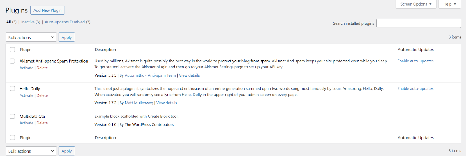
For now, the scaffolding process has already built the essentials to kickstart your custom block development. To activate the plugin, go to the Plugins page in your WP admin.
Activate your custom block plugin
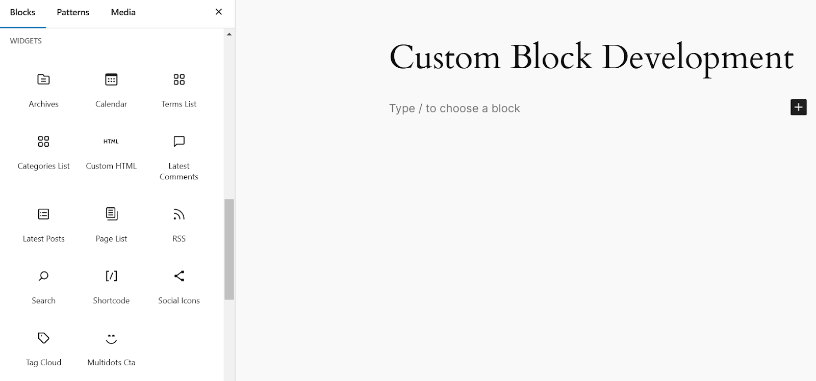
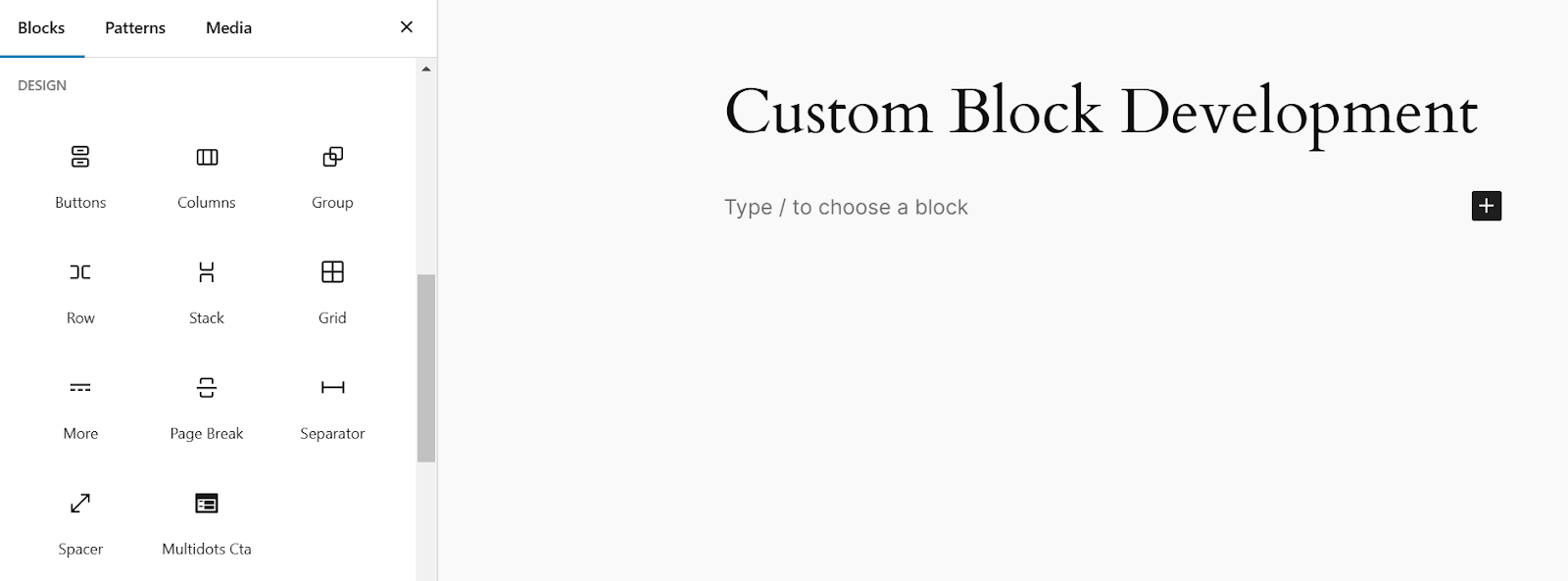
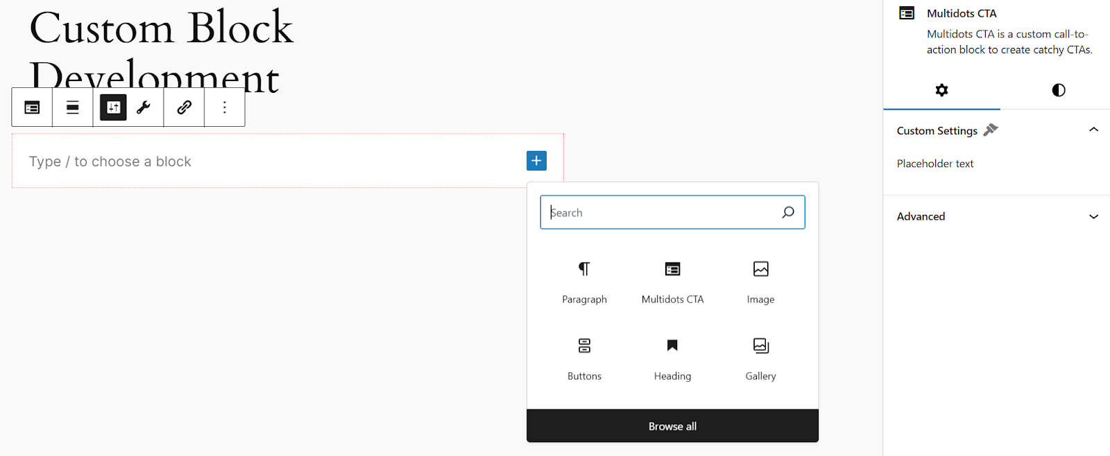
After activating the plugin, create a new post or page and open the block inserter tool. You’ll find the multidots-cta block listed here under Widgets.
Insert your custom block from the block inserter tool
Why Widgets? Because that’s the block category set for all blocks created by the create-block tool. That same is true for the default smiley block icon. You can see them both defined in the block.json file.
Default block.json file generated by the create-block tool
You can also set other block values here, like its title, icon, description, etc. We’ll discuss this in more detail later.
The default WordPress block categories are:
- Text
- Media
- Design
- Widgets
- Theme
- Embeds
A CTA can be considered a design element on a webpage so that you can change the category to design.
Now, change the icon, too. While you can use any SVG icon, choosing a Dashicon is easier. The feedback icon looks close enough to our use case, so let’s set it to that. While at it, you can also change the title and description to something more appropriate. It’s also good to copy-paste the same changes to the plugin-name.php file.
Save the file and refresh the page in your browser. You’ll see no changes.
Why? That’s because you’ve only made the changes in the src folder, and those changes haven’t been propagated to the build directory yet. WordPress uses code from the build directory to create the block. You should run the npm run build command in the terminal to do that.
You can now see the changes reflected in the block inserter tool.
Your custom block with the updated icon
Insert the Block and Understand Edit and Save Functions
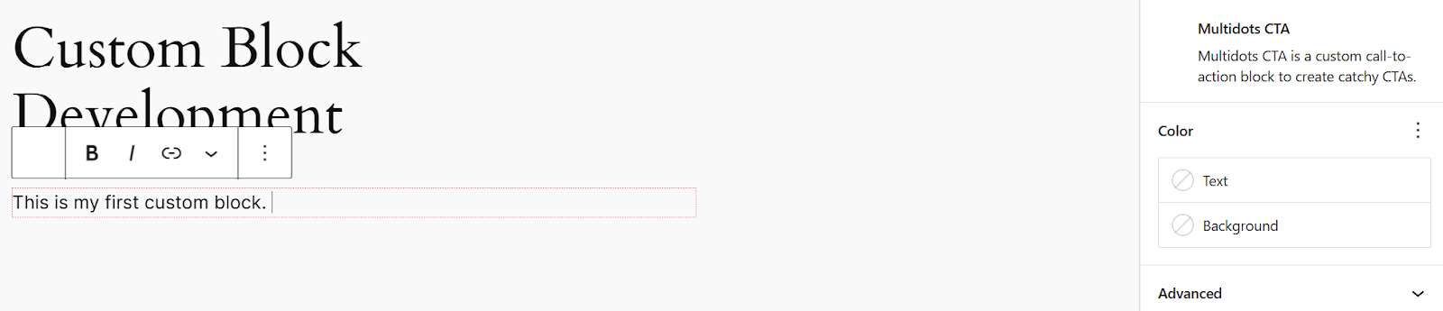
Click the Multidots Cta block icon to insert it in your post. By default, it’ll look something like this:
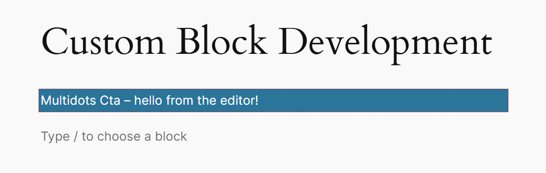
The default block scaffolded by the create-block tool
The text is from the Edit() function defined in the src/edit.js file.
The Edit() function in the edit.js file
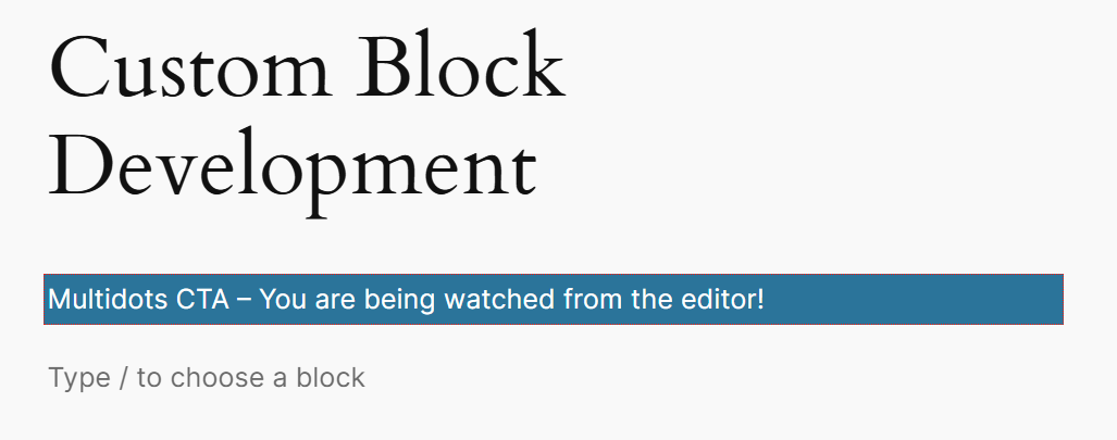
Publish the page or post and see how it looks on the frontend. It’ll look like this:
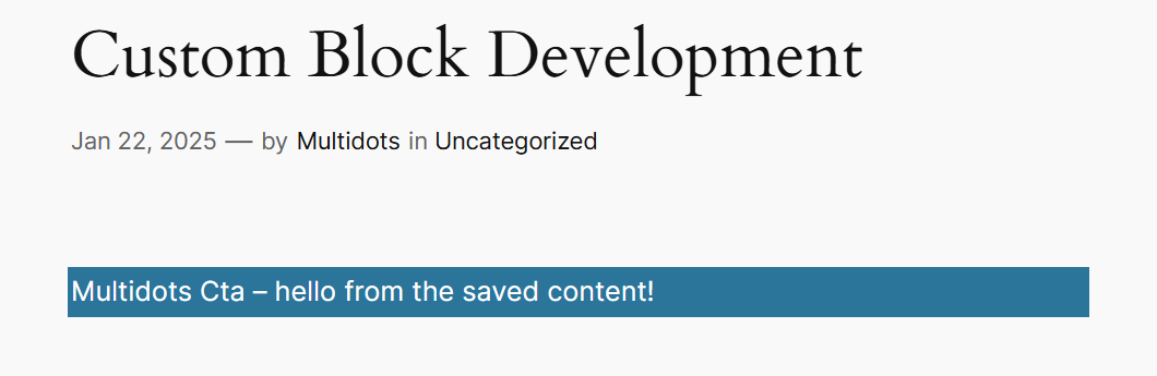
The frontend of the custom block
It’s different from what you see in the editor, as this text is from the save() function defined in the src/save.js file.
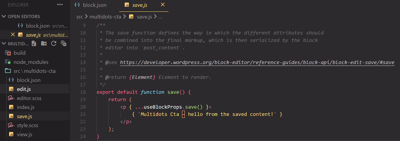
The save() function in the save.js file
The edit.js file determines what you see in the block editor, while the save.js file determines what the browser displays. By default, they’re both set manually, but we can link them so that changes you make inside the editor reflect on the site's frontend.
Automate Build with the npm start Command
Running the npm run build command every time you update your block code can be tiresome. You can automate this process by running the npm start command in the plugin directory.
This command starts a continuous build process, monitoring changes inside the project directory. If it finds any changes, it first checks for errors. It pushes the new code to build and continues monitoring if no error occurs.
Go ahead and edit the text in the edit.js and save.js files. When you save the file, you’ll see this automatic output in the terminal:

Check your terminal to confirm the build process
The process will continue running until you close the terminal or it encounters an error.
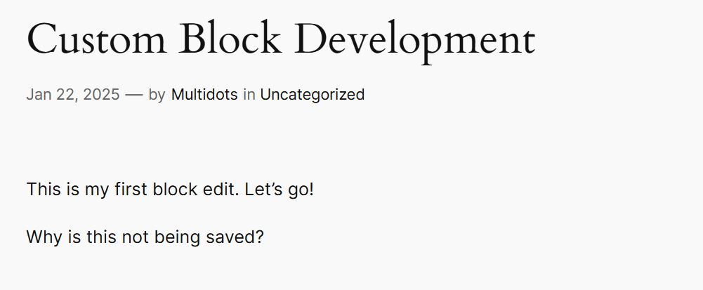
Refresh the post editor to see the changes. You may see this block validation error:
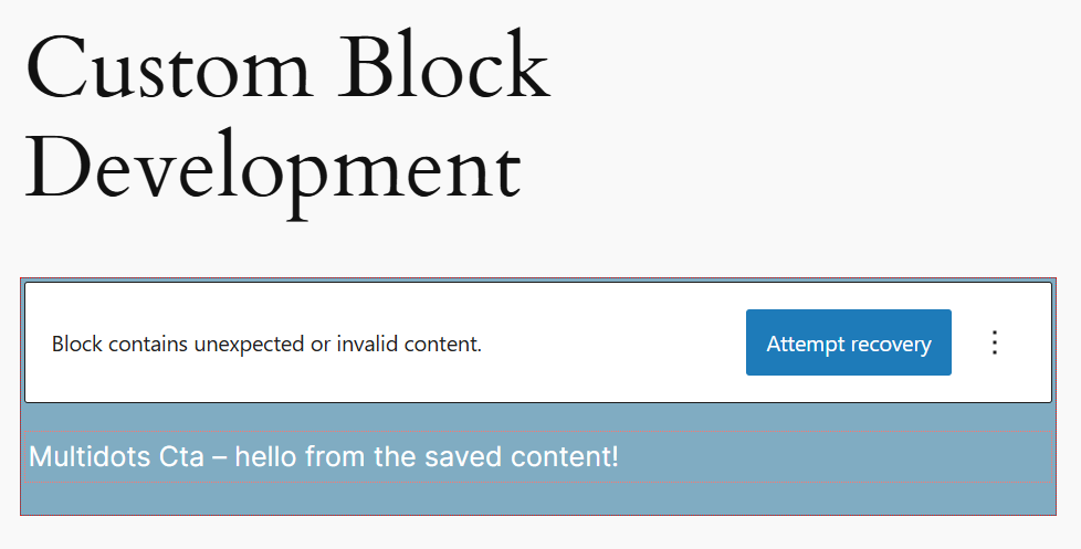
Block validation error after changing the save() function
This error is common during block development, as the new block content differs from the one stored in the database. Remember that the database gets updated only when you Save or Publish a post.
You can click the Attempt recovery button to recover the block as much as possible. In most cases, you’ll see the new block content, but you may have to delete this instance of the block and add a new one if it doesn’t recover perfectly.
The updated block text in the editor
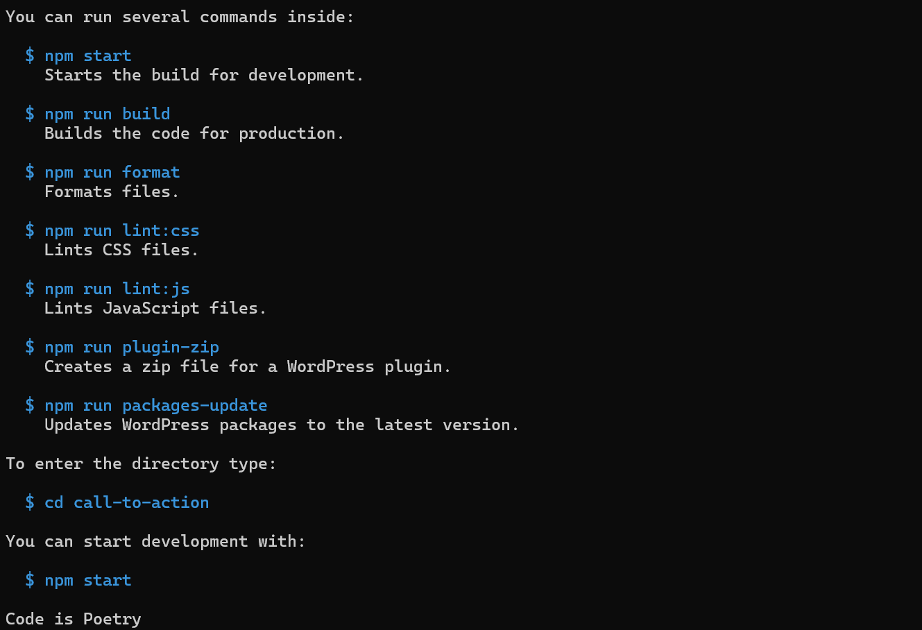
You can also use the other commands to format and lint the code, update the WordPress packages, or enter the folder where development occurs. But for now, npm start is all we need.
Make the Block Interactive with RichText
You’ve added the new block, but it’s a static piece of code right now. It outputs predefined text in the editor and on the frontend. You cannot edit it yet!
Let’s make the block interactive by allowing users to edit its content.
For this, you can use the built-in <RichText> component provided by Gutenberg.
How To Add Components To a Block
Here’s a simple process to add a component to any Gutenberg blog:
- Plan the data this component needs.
- Add those data as attributes to the
block.jsonfile. - Import the component in the
edit.jsfile and add it to the JSX returned by theEdit()function. - Add an event handler to update the attributes.
- Import the same component in the
save.jsfile and add it to the JSX returned by thesave()function.
Note this process down, as you’ll use it repeatedly during Gutenberg block development.
As of now, we just want to make the block content editable.
Considering this, let’s add the attributes field to the block.json file. It is ideal to add it at the same level as all the other properties, just after the example field.
{
  "name": "create-block/multidots-cta",
  .
  .
  .
  "attributes": {}
}
A block can contain as many attributes as needed. Since the block text is just content, its attributes property will only include the content attribute, which handles the text entered by the user.
You can learn more about block attributes here.
"attributes": {
  "content": {
    "type": "string",
    "source": "html",
    "selector": "p"
  }
}
As this text is a string, that’s its type. Its source is the html <p> element inside the Edit() and save() functions, so that’s its source and selector.
You’ve finished Steps 1 and 2 of adding a component to a block. Next, move to Step 3 by opening the edit.js file.
Import the RichText component where you see useBlockProps, then add it to the RichText component to the Edit() function’s return statement.
import { useBlockProps, RichText } from "@wordpress/block-editor";
.
.
.
export default function Edit() {
    return (
        <RichText
            { ...useBlockProps() }
            tagName="p"
            onChange={ onChangeContent }
            value={ attributes.content }
            placeholder="Enter your text here..."
        />
    );
}
The RichText component now wraps the useBlockProps component and adds a tagName with an HTML selector, the name of the event handler function (onChangeContent), and an attribute value. You can set styles for your block by passing a { style: styleName } parameter while defining useBlockProps().
You need to pass the attributes value as a parameter to the Edit() function so that it can access it.
export default function Edit( { attributes } ) {
.
.
}
Moving on to Step 4, define the event handler function. Before the return statement, define this function inside the Edit() function.
const onChangeContent = ( val ) => {
    setAttributes( { content: val } );
};
The event handler function uses setAttributes to establish the attributes, so you must also pass this as a parameter to the Edit() function.
export default function Edit( { attributes, setAttributes } ) {
.
.
}
The final step is to make similar changes in the save.js file to save the edited block content when you save the post or page. As with edit.js, import the RichText component and add these changes to the save() function.
import { useBlockProps, RichText } from '@wordpress/block-editor';
.
.
.
export default function save( { attributes } ) {
return (
<RichText.Content
{...useBlockProps.save()}
tagName="p"
value={attributes.content}
/>
);
}
Save the changes. Check the terminal to ensure npm start has successfully compiled the new build. If not, fix any errors and rerun the process.
You can now check your block in the editor again.
As before, changing your save() function will cause the block to return an error in the editor. Just recover the block, and everything will be fine! It should now be editable.
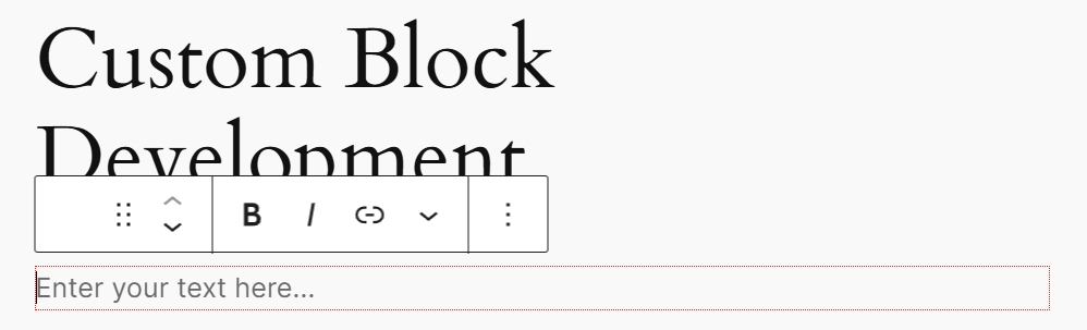
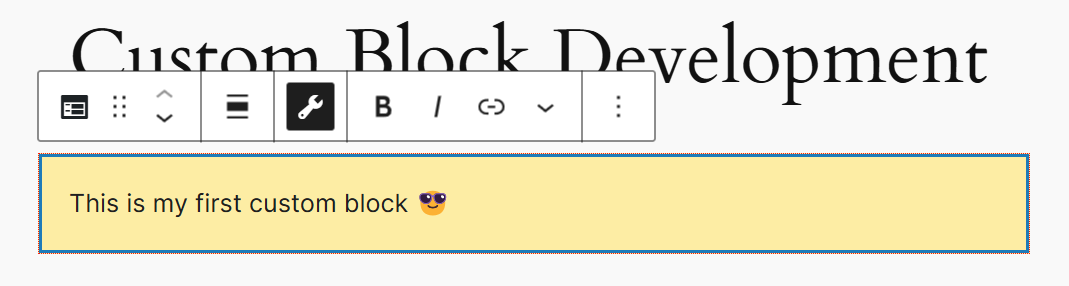
You can edit the text in the block now
The placeholder text you added to the code is visible here. In the toolbar above, you can also see the default formatting options, such as making the text Bold, Italicized, etc. These are provided by the RichText component.
You can type any text in the block, save or publish the post, and see how it appears on the frontend.
The text you enter is displayed on the frontend
You’ve now set up a basic custom block. Let’s customize it further by building on top of it.
Define Block Keywords to Help With Block Search
You can define keywords to help users search for your block in the block inserter tool.
For our block, we can add keywords such as cta, call to action, multidots, and marketing. You define these keywords in the block.json file. We recommend adding them after the description property.
"keywords": [
"cta",
"multidots",
"call to action",
          "marketing"
],
You will see the block listed when you search for any of these keywords in the block inserter tool.
Additionally, our block will be more than just a paragraph, so its <p> opening and closing tags are not ideal. Change it to <div> by replacing all instances of <p> in edit.js, save.js, and block.json files.
Adding Customization Options to Your Block
Gutenberg blocks are powerful because of their customization possibilities. They allow users to change the look and feel of blocks per their requirements.
You do this customization via the block toolbar above the block and the Inspector Panel, which you can find in the block editor on the right. For instance, this is how the image block’s Inspector Panel looks:
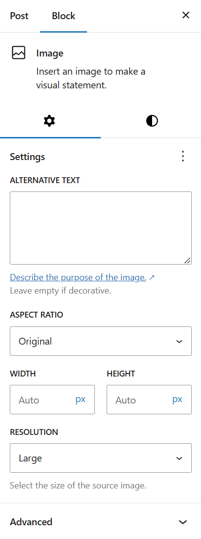
The image block’s default Inspector Panel options
The image block provides customization options for Settings and Styles. Under the Settings tab, you can set the image’s Alternative Text, Aspect Ratio, Width, Height, Resolution, and other advanced options.
These customization options are added via various block controls. Let’s learn more about them.
Adding Block Supports Controls
Now, let’s add some controls to our CTA block’s Inspector Panel so that users can customize the block.
You can create custom controls to enable various customization options —we’ll learn about them later. However, since some customization options are standard across most blocks, such as changing the text color, background color, padding, margins, etc., Gutenberg provides an easy way to add these default support properties to any block.
You add a few lines of code to the block.json file—no JavaScript, PHP, or React code. The useBlockProps hook automatically uses any supports you add here.
There are various advantages of using block supports properties over customizing your own block controls:
- You keep the code DRY by not duplicating the same logic across multiple blocks.
- Better user experience, as users are already familiar with how core blocks work, and they’ll expect the same behavior with your block.
Let’s allow users to change the block’s text and background color for now. To do that, open the block.json file and find the supports property. Make it so:
"supports": {
"html": true,
          "color": {}
},
Save the file and check the terminal to see if the changes have been compiled successfully. Go back to the WordPress editor and refresh the post or page. You should now see a Color tab in the block’s Inspector Panel.
Adding a Color tab to your custom block
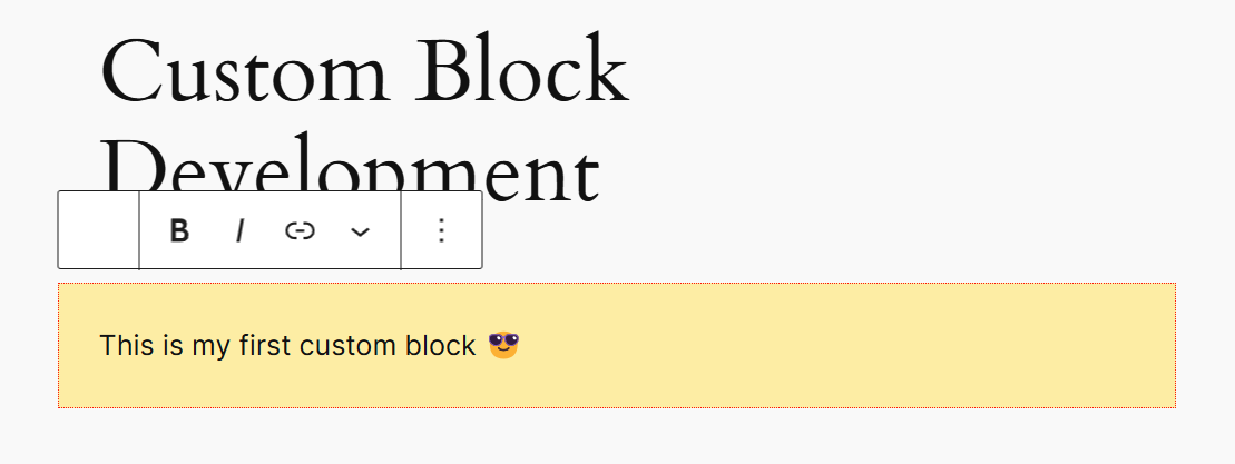
Go ahead and try a few color examples. It’s that easy to add basic color customization options.
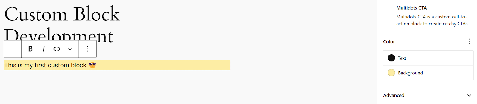
Setting new text and background colors
Next, we should allow users to set the block’s margin and padding. The spacing supports handle these properties.
"supports": {
  "html": true,
  "color": {},
  "spacing": {
    "margin": true,
    "padding": true
  }
}
Save the block.json file again and refresh the editor page. The block’s Inspector Panel will now have a new Dimensions section.
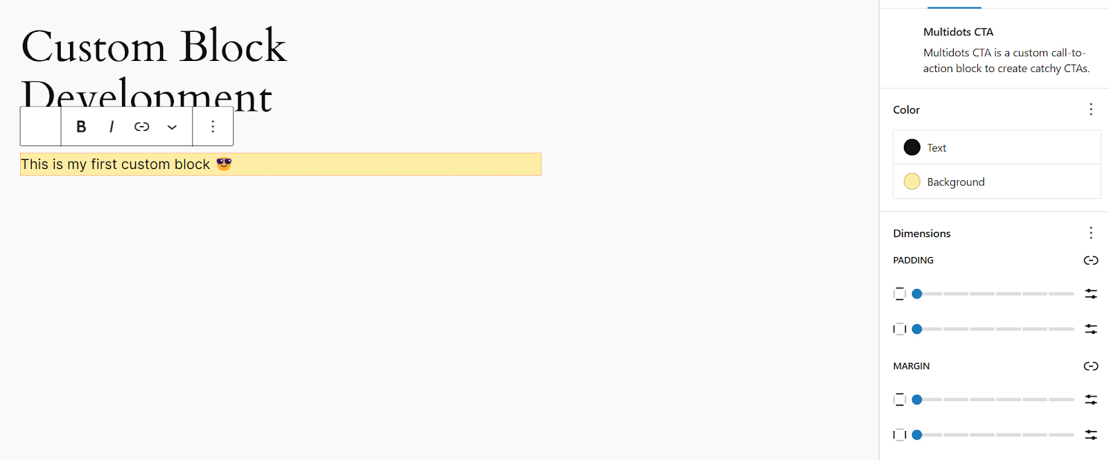
Adding spacing options to your custom block
Play with the padding and margin settings and save the page.
Your custom block with new spacing options
Some block supports add the customization options to the block’s Inspector Panel, while others add them to the toolbar directly above the block. For example, enabling the align block support adds the Align button to the toolbar.
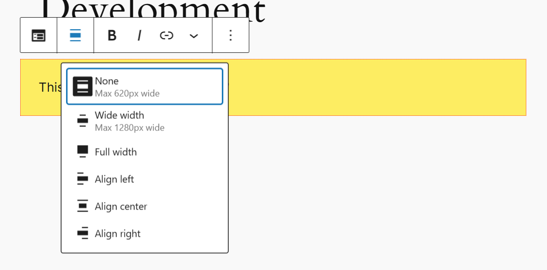
The Align button in the block toolbar
It’s that easy to add these customization options to any block.
The Block Supports API in the Block Editor Handbook is an excellent resource for familiarizing yourself with all the available supports.
Setting Default Properties in block.json
Wouldn’t it be great if the block is styled like this when the user inserts it? You can do that by setting a default value for all block supports. All you must do is add a style property to the attributes object. Here’s how you define it:
"attributes": {
  "content": {
    "type": "string",
    "source": "html",
    "selector": "div"
  },
  "style": {
    "type": "object",
    "default": {
      "color": {
        "text": "#1f1f1f",
        "background": "#ffeda3"
      },
      "spacing": {
        "padding": {
          "top": "20px",
          "right": "20px",
          "bottom": "20px",
          "left": "20px"
        }
      }
    }
  }
}
You can define default values for all block supports under the style property, which takes the type of an object.
Save the file and then refresh your editor. Then, try inserting a new instance of your custom block. It will be populated with the default color and spacing values. Default values are a great way to introduce your custom block to new users.
Adding Custom Options to Block Toolbar and Inspector Panel
Now that we’ve learned how to work with block supports, let’s see how to add or remove buttons from our block toolbar to give users more customization options.
To add block toolbar buttons, we need to import a new component called BlockControls. Like before, here’s where you import the component in the edit.js file.
import {
    useBlockProps,
    RichText,
    BlockControls
} from '@wordpress/block-editor';
Next, you must add this component to the Edit() function’s return() statement at the same level as the RichText component. The BlockControls component can be self-closing or not, depending on how you use it.
However, as a React component can only return one element, you need to wrap both the BlockControls and RichText components in an empty fragment:
return (
<>
<BlockControls />
<RichText
{...useBlockProps()}
tagname="div"
onChange={onChangeContent}
value={attributes.content}
placeholder="Enter your text here..."
/>
</>
);
You can add a prop called controls to this new BlockControls component. This prop is an array of objects representing each button in the toolbar. These objects, in turn, accept properties like title, icon, and an onClick function.
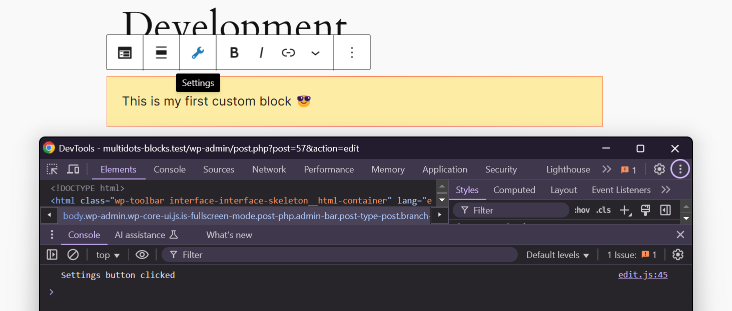
Let’s add a generic settings button with an onClick() function that logs the button press to the browser console.
<BlockControls controls={ [ {
title: "Settings",
icon: "admin-tools",
onClick: () => console.log("Settings button clicked"),
} ] } />
Save the file and refresh the editor. You’ll now see a new Settings button in your custom block’s toolbar. Pressing it will output the button press message to the console.
The "Settings" button in the custom block’s toolbar
You can also add an isActive property to your button object to highlight it in the toolbar. This highlight is great for dragging the users' attention toward important settings in your toolbar.
<BlockControls controls={[{
title: "Settings",
icon: "admin-tools",
isActive: true,
onClick: () => console.log("Settings button clicked"),
}]} />
The toolbar will now highlight the new Settings button.
The "Settings" button is now highlighted
To add more buttons, you can duplicate this button object in your array and choose a different title, icon, and onClick() function.
This method would do for simple toolbar customization.
However, there’s an easier way to do this using the @wordpress/components package. This package is installed automatically as a dependency with the create-block tool. Still, if you created the block plugin manually, you can install it in your custom block plugin directory through your terminal.
npm i @wordpress/componentsAfter it’s installed, import the ToolbarGroup and ToolbarButton components from @wordpress/components.
import { ToolbarGroup, ToolbarButton } from "@wordpress/components";Now, you can use these components within the BlockControls component to add the buttons. In this case, the BlockControls component isn’t self-closing, as we’re adding other components inside it.
The ToolbarButton component accepts the same properties for buttons as the ones discussed above, like so:
<BlockControls>
<ToolbarGroup>
<ToolbarButton
title="Settings"
icon="admin-tools"
isActive="true"
onClick={() => console.log("Settings button clicked")}
/>
</ToolbarGroup>
</BlockControls>
The benefit of adding block toolbar buttons this way over the previous one is that you can group buttons according to their functions and add other non-button components within the group, such as text, dropdown menus, logos, etc.
Let’s add a few more buttons to the ToolbarGroup, and create another ToolbarGroup with another button to highlight this feature.
<BlockControls>
<ToolbarGroup>
<ToolbarButton
title="Settings"
icon="admin-settings"
isActive="true"
onClick={() => console.log("Settings button clicked")}
/>
<ToolbarButton
title="Tools"
icon="admin-tools"
onClick={() => console.log("Tools button clicked")}
/>
</ToolbarGroup>
<ToolbarGroup>
<ToolbarButton
title="Links"
icon="admin-links"
onClick={() => console.log("Links button clicked")}
/>
</ToolbarGroup>
</BlockControls>
The above code is reflected as such in the block toolbar:
Multiple block toolbar buttons into groups
Notice the delineation between the first block toolbar group (Settings and Tools icons) and the second one with the Links icon.
Now, let’s see how to add similar customization options to the block’s Inspector Panel on the side. You do this via the InspectorControls component from the @wordpress/block-editor package.
It’s similar to importing and adding BlockControls. First, you import it and then add the InspectorControls component to the Edit() function’s return statement within the empty fragment. Add a placeholder paragraph text to see how it appears in the sidebar.
import {
useBlockProps,
RichText,
BlockControls,
InspectorControls
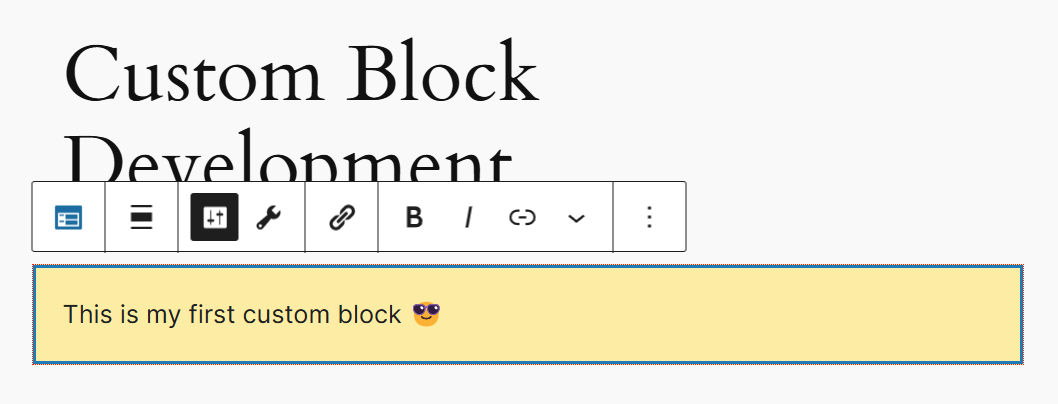
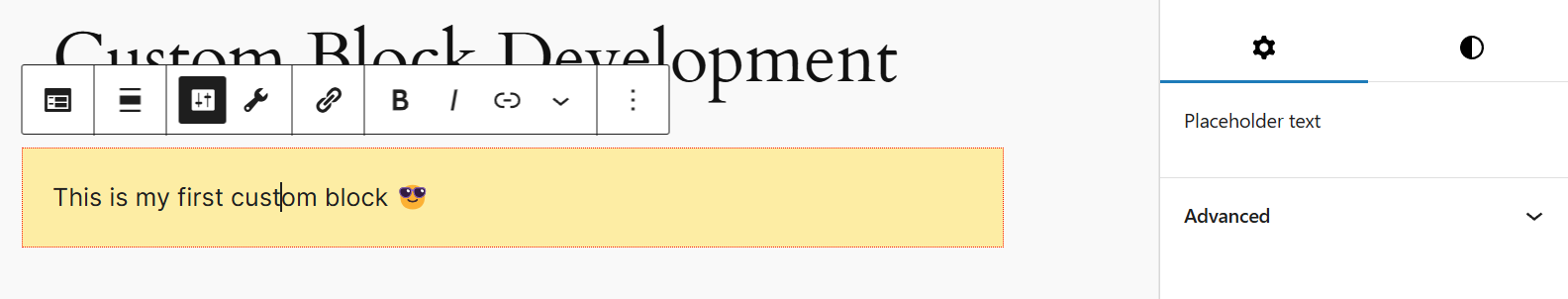
} from '@wordpress/block-editor';<InspectorControls>
<p>Placeholder text</p>
</InspectorControls>Save the file, refresh the editor in your browser, and check the sidebar.
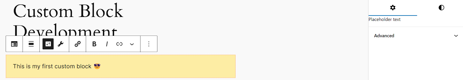
Check the "Placeholder text" in the sidebar
You can see the placeholder text in the sidebar, but it doesn’t look great. Thankfully, WordPress provides a component called PanelBody to fix that. It will make your block’s custom sidebar panels prettier.
import { ToolbarGroup, ToolbarButton, PanelBody } from "@wordpress/components";Place the PanelBody component inside the InspectorControls component. It also accepts props such as title, icon, initialOpen, onToggle, etc. You can find the list of supported Panel props in the Block Editor Handbook. Here’s an example of how it works:
<InspectorControls>
<PanelBody
title="Custom Settings"
icon="admin-appearance"
initialOpen
>
<p>Placeholder text</p>
</PanelBody>
</InspectorControls>
Save the file, and refresh the post editor in your browser. The block’s new custom settings panel in the sidebar is much prettier now.
Better sidebar menus with PanelBody component
Now that you’ve seen how to add custom sidebar panels, let’s make our custom block more like an actual call to action block.
Make Nesting Blocks with InnerBlocks Component
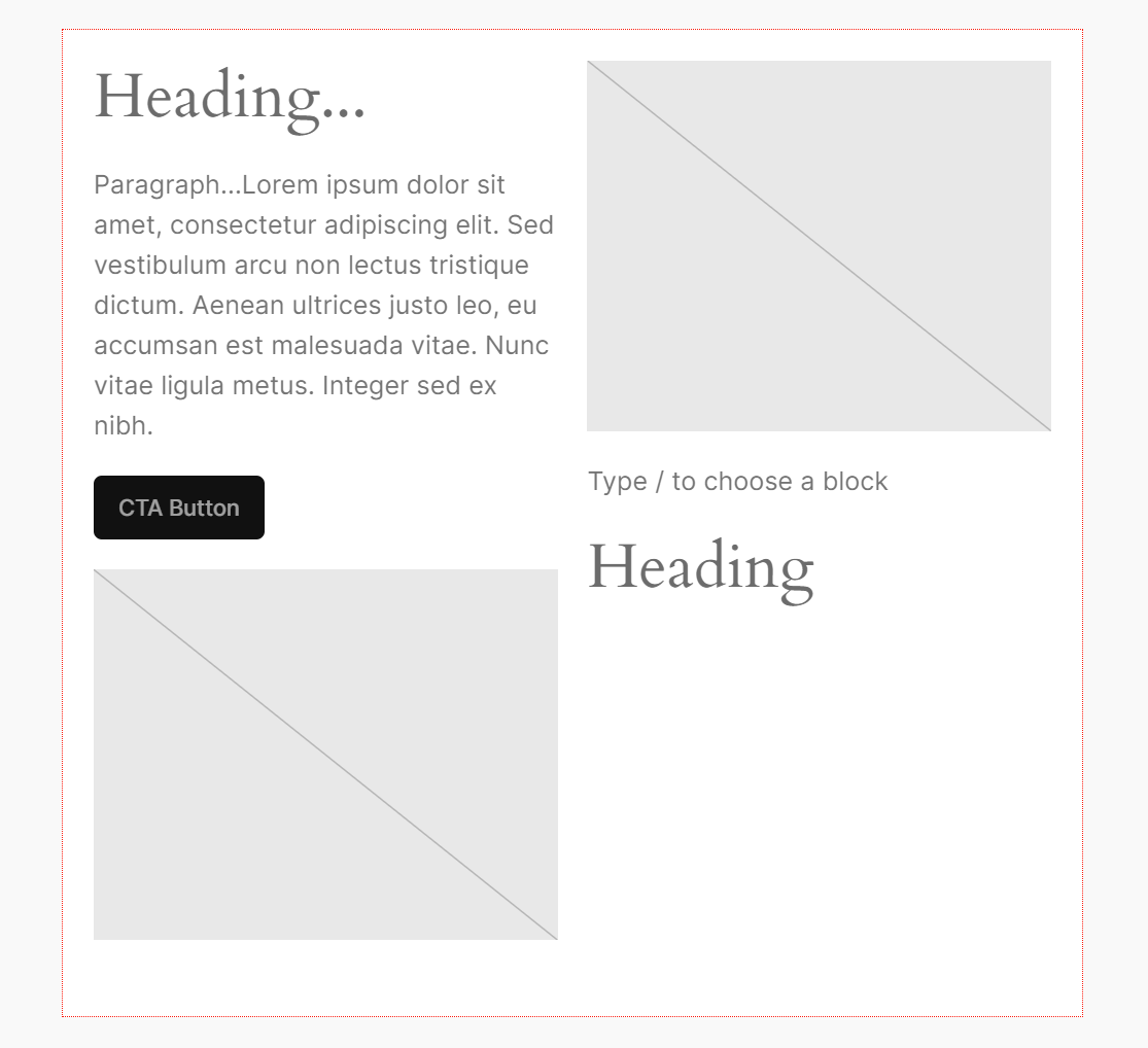
Planning how your block looks is a great way to start development. Here’s a wireframe mockup of the CTA block we intend to make:

Wireframe mockup of the CTA block
Notice how it has multiple sections spread across two columns. First, there’s the heading, followed by body text and a CTA button. On the right, there is an image.
These are all core blocks. But how do you fit all of these blocks together in a single block? The solution is nested blocks. WordPress provides the InnerBlocks component from the @wordpress/block-editor package to do that. Let’s use it to create our custom CTA block.
First, import the component from the package.
import {
useBlockProps,
InnerBlocks,
BlockControls,
InspectorControls
} from '@wordpress/block-editor';
The child blocks handle all the content inside the InnerBlocks component so that you won’t need a content attribute. Hence, remove this section from the block.json file.
"content": {
  "type": "string",
  "source": "html",
  "selector": "div"
},
Since there is no content attribute, there will also be no onChangeContent event. Therefore, all code related to this handler function should be removed from the Edit() function.
The child blocks—nothing but core blocks—can handle content changes by default. So you won’t need the RichText component either.
Remove it and replace it with a simple <div> component. The <div> tag will include the useBlockProps component and enclose the self-closing InnerBlocks component.
<div { ...useBlockProps() }>
    <InnerBlocks />
</div>
Save the edit.js file and refresh your editor page. You’ll see an empty CTA block with no content. However, when you hover over it, you’ll see a plus icon, which is nothing but the Block Inserter tool.
Custom Block with InnerBlocks component
Note: We’ve modified the default color and spacing properties we defined earlier in the block.json file.
You can insert any block within your parent custom block. These child blocks will each have their own Toolbar and Inspector Panel. Go ahead and experiment with them a bit.
Add multiple blocks inside your custom block with InnerBlocks
This feature is cool, but our custom CTA block doesn’t need access to all the available Gutenberg blocks. It’ll be confusing to the user and lead them astray.
It only needs four blocks: Heading, Paragraph, Button, and Image.
You can limit what blocks are allowed inside the InnerBlocks component with the allowedBlocks property, which is an array of all the blocks you want to allow.
Note: The official Core Blocks Reference lists all the available core blocks and shows what supports and attributes they can handle.
To add the allowedBlocks property, first define a constant called ALLOWED_BLOCKS inside your Edit() function. You can name this constant whatever you want, but this makes it more apparent at first glance. Just make sure to define it before the return() statement.
const ALLOWED_BLOCKS = ['core/heading', 'core/paragraph', 'core/image', 'core/button'];Now you can declare the property inside the InnerBlocks component, like so:
<InnerBlocks allowedBlocks={ ALLOWED_BLOCKS } />Note: You have to wrap the constant in curly braces {} as you’re using a JavaScript element (const) inside a JSX statement. That’s how embedding expressions in JSX works in React.
Save the changes and refresh your editor. Now, when you try adding blocks inside your custom block, you can only choose from the four allowed blocks we defined above.
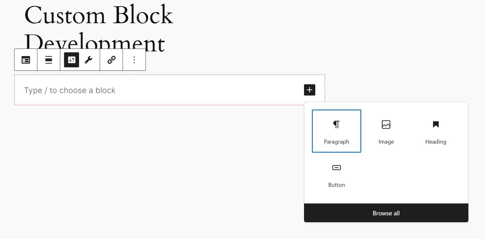
Choose blocks from only the four allowed blocks
Add any content to your block and save it. You’ll notice that these changes don’t reflect on the frontend. That’s because you haven’t updated the save() function to use the InnerBlocks component yet.
Open the save.js file and import the InnerBlocks component:
import { useBlockProps, InnerBlocks } from '@wordpress/block-editor';Next, modify the save() function’s return() statement to reflect this change:
export default function save({ attributes }) {
return (
<div {...useBlockProps.save()}>
<InnerBlocks.Content />
</div>
);
}
The changes you make to your custom block will now appear on the frontend.
Create a Block Template and Lock It
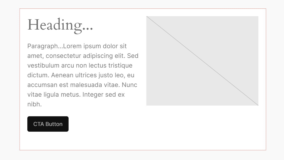
We’ve established the core features of our block. Now, we must refine its design to reflect our vision. The InnerBlock component’s template property allows us to do that.
Using the template property, you can prefill your custom block with a set of blocks in the order you define. You can also define them across multiple columns—in our case, we need two columns.
Like the allowedBlocks property, the template property accepts an array of blocks. Since each block defined in the template can have its own properties, the array will consist of inner arrays, each representing a content block.
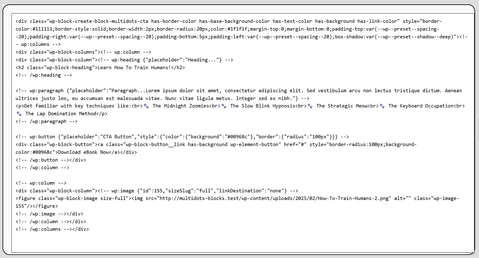
Open the edit.js file. Before using the template property in your InnerBlocks component, define a constant array called CTA_TEMPLATE (you can name this constant anything you like).
const CTA_TEMPLATE = [
['core/columns', {}, [
['core/column', {},
[
['core/heading', { level: 2, placeholder: 'Heading...' }],
['core/paragraph', { placeholder: 'Paragraph...Lorem ipsum dolor sit amet, consectetur adipiscing elit. Sed vestibulum arcu non lectus tristique dictum. Aenean ultrices justo leo, eu accumsan est malesuada vitae. Integer sed ex nibh.' }],
['core/button', { url: '#', placeholder: 'CTA Button' }],
]
],
['core/column', {}, [
['core/image', {}],
]
],]
]
];
This template creates a two-column layout with specific blocks inside each column. It starts with the core/colums block and an empty {} curly braces, signifying no additional attributes to the parent columns block.
Next, you add the first core/column block, and inside this column, there are three blocks:
- core/heading: Uses the level : 2 property, signifying a h2 tag, and a placeholder text value.
- core/paragraph: This block just has a placeholder value with some lorum ipsum text.
- core/button: Has a default # URL and a placeholder CTA Button text.
The second core/column block has a single core/image block with no additional properties.
You then add the template property to the InnerBlocks component:
<div
{...useBlockProps()}>
<InnerBlocks allowedBlocks={ALLOWED_BLOCKS} template={CTA_TEMPLATE} />
</div>
Save the file, and refresh your editor to see how your custom block appears.
The custom block template in the WordPress editor
Wherever you add your custom CTA block in the editor, it will resemble this layout. It’s a significant improvement over what we had earlier.
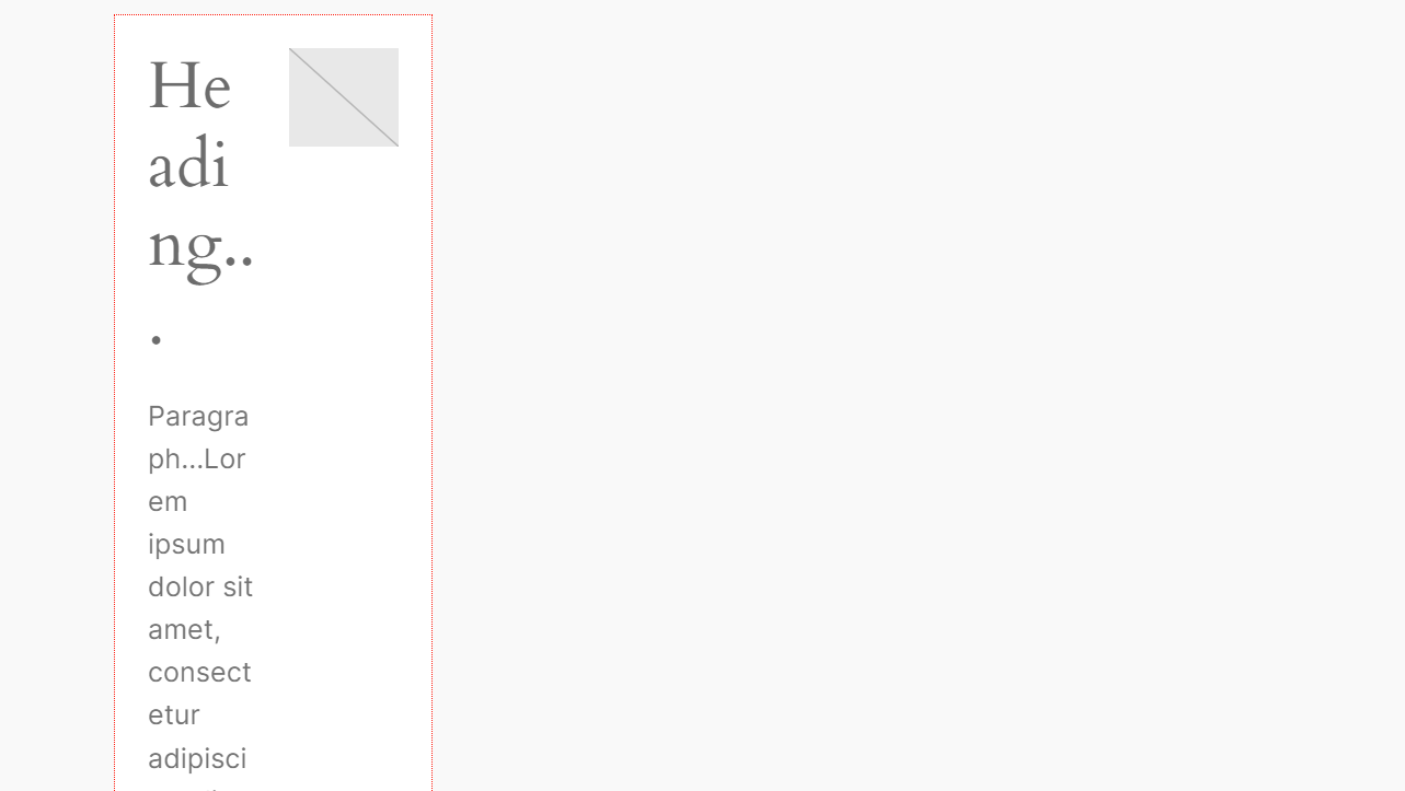
Nevertheless, users can still add more of the allowed blocks to this layout, ruining the design of the custom CTA block. For example, take a look at this:
Custom block template with no locks
Fortunately, you can add a templateLock property to the InnerBlocks component. This property accepts multiple arguments. Since we don’t want users to modify the existing layout, we’ll go with the all argument.
<div {...useBlockProps()}>
<InnerBlocks allowedBlocks={ALLOWED_BLOCKS} template={CTA_TEMPLATE} templateLock="all" />
</div>
Save the file and refresh your WordPress editor page. You’ll see that the custom block’s template is now locked, and you cannot add or delete existing blocks by default.
Add a Parent Block Condition
WordPress includes several core nested blocks, such as Columns, Group, and Grid. Our custom block can be inserted anywhere on WordPress, even within these other nested blocks. The result is strange and hideous.
Insert the custom CTA block within another nested block
You can prevent this behavior by defining a parent property for the block in its block.json file. It accepts an array of allowed parent blocks for the custom block.
Since we want to insert the CTA block at only the root level of the post or page, we can set its parent to core/post-content.
"parent": [
  "core/post-content"
],
Save the file and refresh your editor page. You can no longer add the custom CTA block to any other nested block.
Refining the Custom Block Design
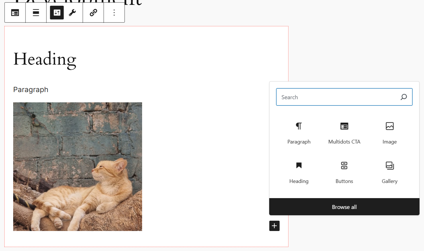
Let’s add some content to our custom CTA block to get started. It will give you an idea of how your block looks right now.

Our custom CTA block with content
The CTA block looks good, but you can refine it further. For instance, you can add a border and drop a shadow around the main block.
The shadow supports can enable drop shadows in your block. To do so, set it to true in the block.json file.
{
"supports": {
      "shadow": true
    }
}
If you now check your editor after refreshing it, you should see a Shadow panel under the Design tab in your block’s Inspector Panel.
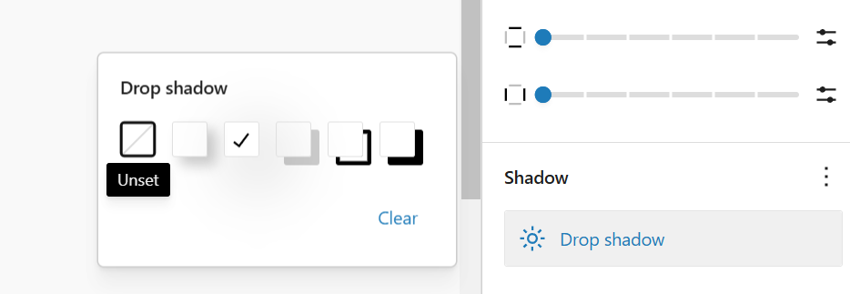
Adding drop shadow support for blocks
Select any drop shadow setting, and you should see it reflected in your block.
Custom block with drop shadow
Unlike shadow supports, WordPress still doesn’t have a permanent supports feature to enable borders for custom blocks. However, it does have an experimental block supports called __experimentalBorder to do just that.
Note: Experimental features can change or become deprecated over time. Use them with caution, especially if you’re pushing the changes live. The __experimentalBorder supports is used by many core WordPress blocks (e.g., the button block), so you can rest easy knowing that WordPress will eventually merge into Core, but with an updated name.
"__experimentalBorder": {
"color": true,
"radius": true,
"style": true,
"width": true
}
Add this supports to your block.json file, save it, and refresh your page editor. You should now see a Border & Shadow panel in your custom block’s Inspector Panel.
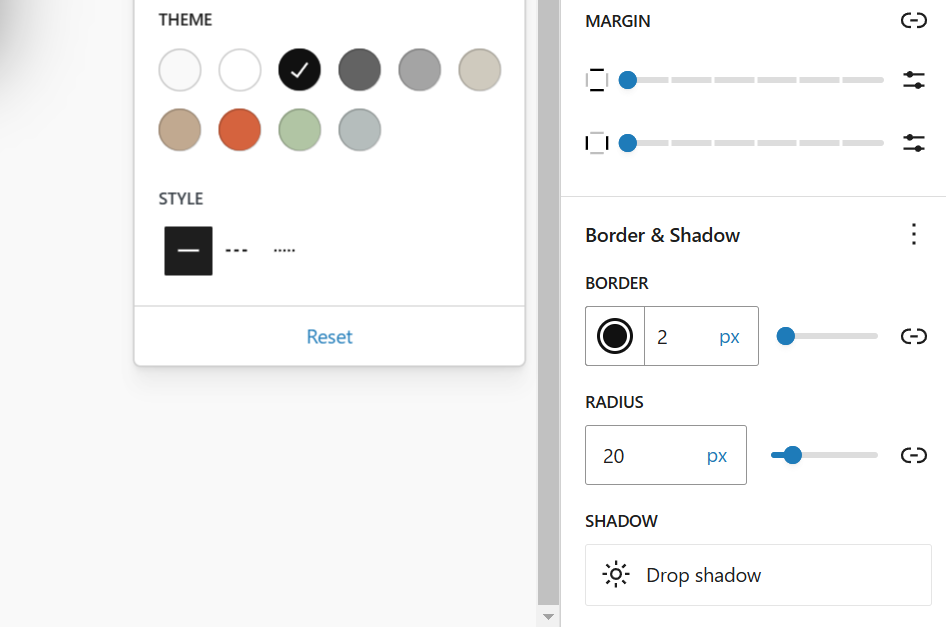
Border & Shadow panel in the custom block’s sidebar panel
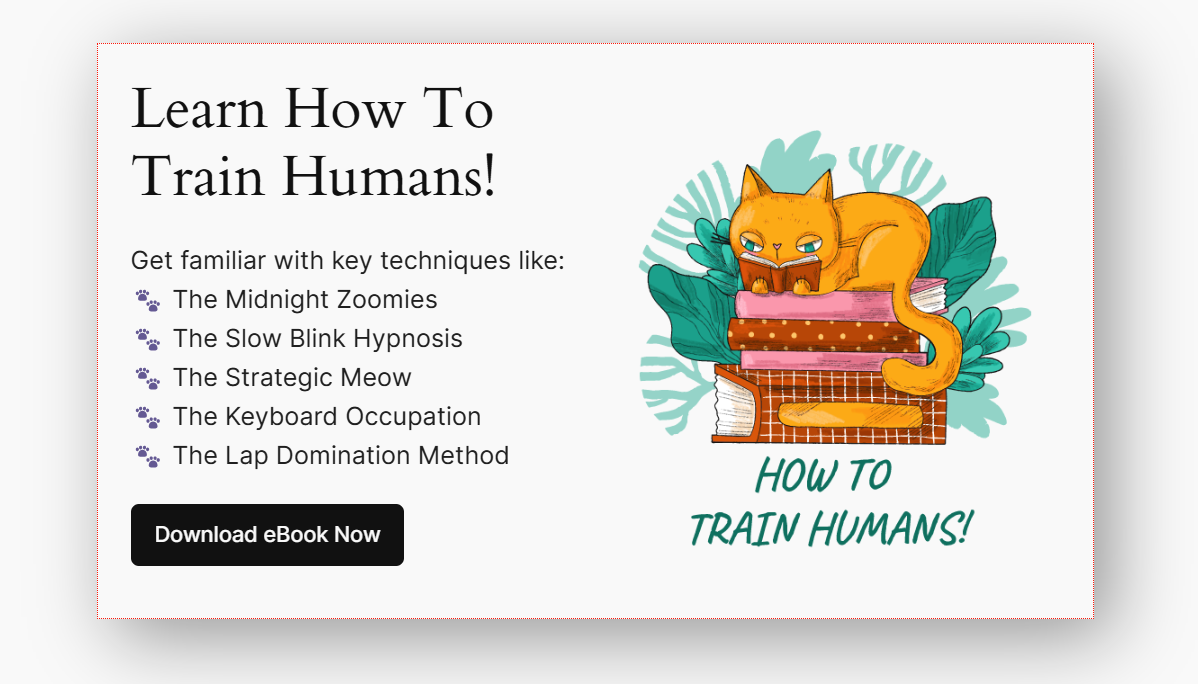
Set the border color, style, and radius. It should now look like this:
Custom CTA block with border and shadow
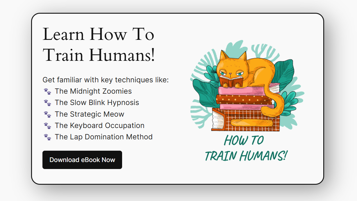
As we work on the details, the design of our custom block keeps getting more refined.
Next, select the button and go to its Design tab in the sidebar. Here, change its background color to a suitable color and set its border-radius to the maximum value. The button will now look more elegant.

Updated button with a new background color and curved border
We’ll stop designing our custom CTA block here. We've come a long way from just a simple text box to the above call to action. If you want, you can continue refining it further to your liking.
Once you’ve finished designing it to your liking, you can set it as a synced pattern and use it across your site.
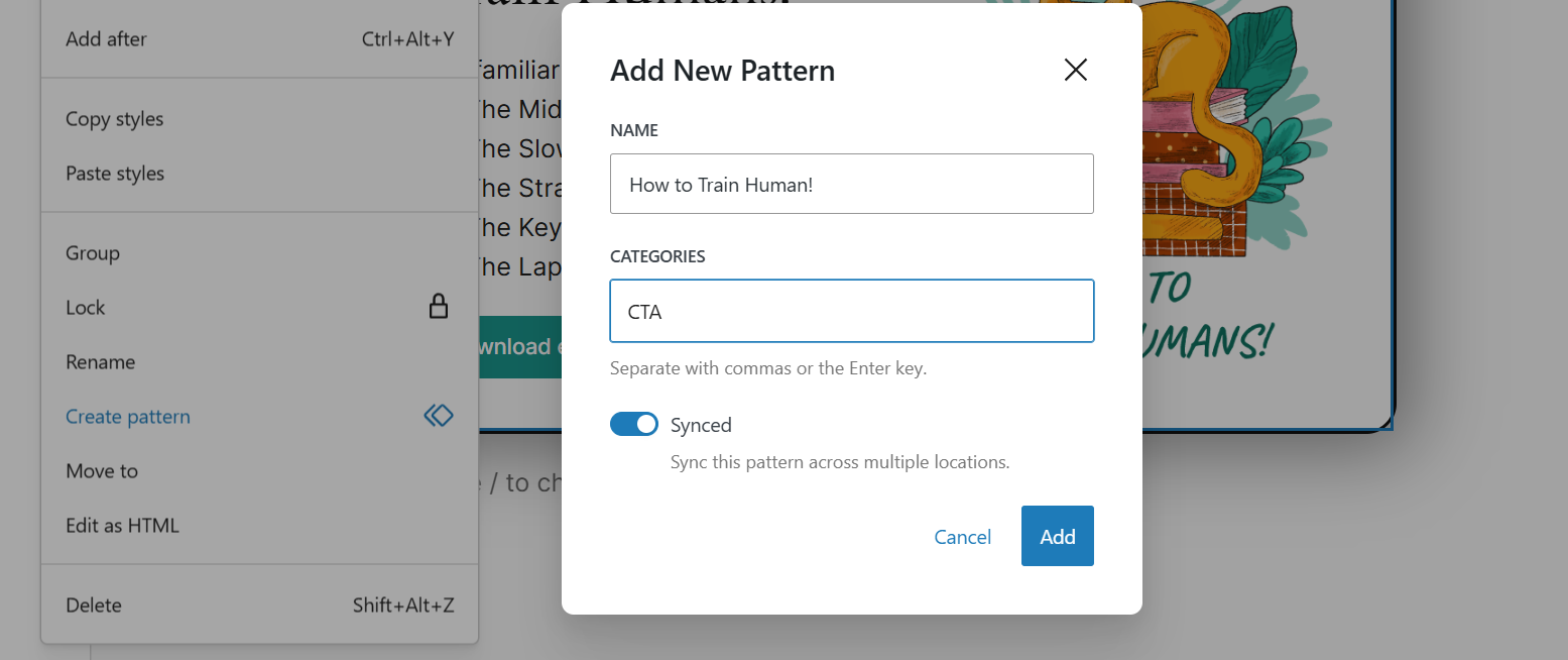
Set the filled-in CTA block as a synced pattern
You can now use it anywhere on your site again by inserting the pattern through the block inserter tool. As it is a synced pattern, editing it on one page will update it automatically across the site.
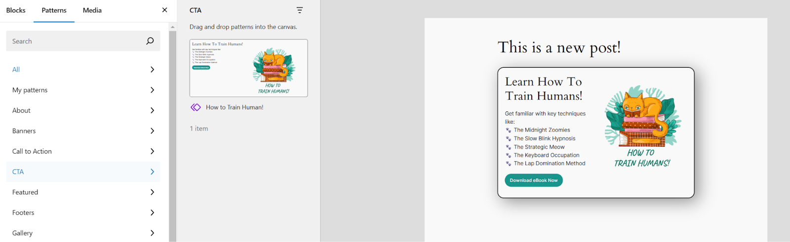
Inserting a pattern through the block inserter tool
Internationalization (i18n): Make Your Plugin Translatable
One of the default components imported by the create-block tool is for internationalization (i18n). It’s the process by which you enable multi-language support for your software.
import { __ } from '@wordpress/i18n';Making your block fully translatable is crucial to reaching a larger audience. Even if you cannot provide translations for many languages, adding internationalization support will allow other users and volunteers to translate your block.
The function that enables all strings in your code to be translated is denoted by __ (two underscores). You’ll notice this function imported in edit.js files at the top.
This function accepts two parameters: the string that needs to be translated and the textdomain defined in the block.json file. The create-block tool automatically sets the textdomain as the project name—it’s also the plugin and block names. In our example, the text domain is multidots-cta.
Hence, the format this function takes is:
__( ' Translate this string', 'textdomain);The first translatable text in our code are the placeholder Heading, Paragraph, and Button values defined in the CTA_TEMPLATE constant.
['core/column', {},
[
['core/heading', { level: 2, placeholder: __('Heading...', 'multidots-cta') }],
['core/paragraph', { placeholder: __('Paragraph...Lorem ipsum dolor sit amet, consectetur adipiscing elit. Sed vestibulum arcu non lectus tristique dictum. Aenean ultrices justo leo, eu accumsan est malesuada vitae. Nunc vitae ligula metus. Integer sed ex nibh.', 'multidots-cta') }],
['core/button', { url: '#', placeholder: __('CTA Button', 'multidots-cta') }],
]
],
The other translatable strings are in the PanelBody component. First is the title—as it’s inside a JSX component, you must wrap its i18n function in curly braces. The second translatable string is the placeholder text, which is internationalized like in the previous section.
<PanelBody
title={__("Custom Settings", "multidots-cta")}
icon="admin-appearance"
initialOpen
>
<p>__('Placeholder text', 'multidots-cta')</p>
</PanelBody>
Do the same with the titles in the BlockControls component.
<BlockControls>
<ToolbarGroup>
<ToolbarButton
title={__("Settings", "multidots-cta")}
icon="admin-settings"
isActive="true"
onClick={() => console.log("Settings button clicked")}
/>
<ToolbarButton
title={__("Tools", "multidots-cta")}
icon="admin-tools"
onClick={() => console.log("Tools button clicked")}
/>
</ToolbarGroup>
<ToolbarGroup>
<ToolbarButton
title={__("Links", "multidots-cta")}
icon="admin-links"
onClick={() => console.log("Links button clicked")}
/>
</ToolbarGroup>
</BlockControls>
Those are the only translatable strings in our project. There are no such strings in the save.js and block.json files.
After these edits, you won’t see any changes in the editor, but your block is now translatable. From here onwards, it’s best practice to i18n all your strings as you write them.
More Custom Block Examples
A unique call-to-action (CTA) block is only the tip of the iceberg when it comes to custom block development in WordPress. Here are some more examples of custom blocks you can build with Gutenberg:
#1 Testimonials Block
This block will showcase your client testimonials with quotes, names, titles, and images. Let's build it quickly using the skills we learned previously.
First, go to your plugins folder in your terminal and scaffold the block plugin using the create-block tool.
npx @wordpress/create-block multidots-testimonialsNext, open the terminal and navigate to your newly created multidots-testimonials plugin folder using the cd multidots-testimonials command. Then, run the npm start command to start observing for changes and initiating the build process.
Activate the plugin in your WordPress dashboard, and open the plugin folder in your code editor workspace.
We’ll start by editing the block.json file:
{
"$schema": "https://schemas.wp.org/trunk/block.json",
"apiVersion": 3,
"name": "create-block/multidots-testimonials",
"version": "0.1.0",
"title": "Multidots Testimonials",
"category": "widgets",
"icon": "admin-comments",
"description": "A custom Gutenberg block to display testimonials.",
"keywords": [
"testimonial",
"review",
"multidots",
"feedback"
],
"example": {},
"supports": {
"html": false
},
"attributes": {
"name": {
"type": "string",
"default": ""
},
"imageURL": {
"type": "string",
"default": ""
},
"testimonial": {
"type": "string",
"default": ""
}
},
"textdomain": "multidots-testimonials",
"editorScript": "file:./index.js",
"editorStyle": "file:./index.css",
"style": "file:./style-index.css",
"viewScript": "file:./view.js"
}
Here, we edit the block’s icon and description and add three attributes: name, imageURL, and testimonial.
Next, update the edit.js file to create an interactive block.
import { useBlockProps, RichText, MediaUpload, InspectorControls } from '@wordpress/block-editor';

import { PanelBody, Button, TextControl } from '@wordpress/components';
Here, we import many WordPress components from two @wordpress packages to create our block:
- useBlockProps: This react hook is added automatically by the create-block tool. It provides many essential block-related functionality, like class names and styles. It’s essential to integrate the block with the WordPress editor.
- RichText: This component allows you to edit the text inside the block using rich text editing features (e.g., bold, italics, etc.).
- MediaUpload: Adds media upload functionality (images, videos, etc.) from the WordPress media library.
- InspectorControls: A wrapper component that adds controls to the block’s Inspector Panel—appears on the sidebar when the block is selected.
- PanelBody: Adds a collapsible panel to the Inspector Panel. Often used to group various settings.
- Button: Adds a button component to let users trigger actions by clicking on it.
- TextControl: Adds an input field for text. Typically used to configure block settings.
After importing the components, build on them inside the edit() function.
export default function Edit({ attributes, setAttributes }) {
const { name, imageURL, testimonial } = attributes;
return (
<div {...useBlockProps()}>
<InspectorControls>
<PanelBody title={__('Testimonial Settings', 'multidots-testimonials')}>
<TextControl
label="Name"
value={name}
onChange={(value) => setAttributes({ name: value })}
/>
</PanelBody>
</InspectorControls>

<MediaUpload
onSelect={(media) => setAttributes({ imageURL: media.url })}
allowedTypes={['image']}
render={({ open }) => (
<Button onClick={open} className="button button-primary">
{imageURL ? __('Change Image', multidots-testimonials) : __('Upload Image', 'multidots-testimonials')}
</Button>
)}
/>
{imageURL && <img src={imageURL} alt={name} className="testimonial-image" />}

<RichText
tagName="p"
placeholder={__('Enter testimonial...', 'multidots-testimonials')}
value={testimonial}
onChange={(value) => setAttributes({ testimonial: value })}
/>

<RichText
tagName="strong"
placeholder={__('Customer Name...', 'multidots-testimonials')}
value={name}
onChange={(value) => setAttributes({ name: value })}
/>
</div>
);
}
Here’s a breakdown of the above code:
- The
edit()function renders the block inside the editor. It receives two props: attributes (current block data) and setAttributes (used to update block data). - It then defines three constants by extracting the values from the attributes object in the
block.jsonfile. These constants are name, imageURL, and testimonial. - The
return()function begins by wrapping the entire block in a<div>element. It uses theuseBlockProps()React hook to add the required block properties. - Next, the InspectorControls component is added to render the block settings in the sidebar. Inside it is a PanelBody component that adds a collapsible panel. Here, users can enter the name in a TextControl component, which is updated via the
setAttributesfunction. It sets the name of the client or customer. - The MediaUpload component adds access to the WordPress media library. It allows users to select an image for the testimonial—a client or customer profile photo. When the user selects an image, onSelect sets its URL as the imageURL value. The component only accepts images and includes a button to upload or change the image.
- The image is then displayed with a set className, which we’ll use later to style the image.
- Finally, the testimonial and the customer name are added using two separate RichText components. The testimonial uses a
<p>tag, while the customer name uses a<strong>tag. You learned how this works in the previous section. - To internationalize the block and make it fully translatable, all the user-facing labels are enclosed in double underscore __() functions.
Next, you edit the save.js file to render the block on the frontend from the data capture through the editor.
import { useBlockProps, RichText } from '@wordpress/block-editor';

export default function save({ attributes }) {
const { name, imageURL, testimonial } = attributes;

return (
<div {...useBlockProps.save()}>
{imageURL && <img src={imageURL} className="testimonial-image" alt={name} />}
<RichText.Content tagName="p" className="testimonial-text" value={testimonial} />
<RichText.Content tagName="strong" className="testimonial-name" value={name} />
</div>
);
}
The code here is straightforward and works the same way as with our custom CTA block. We’ve added the className property to each element to style them later in the editor.scss and style.scss files.
Next, define the editor.scss, and style.scss styles. Remember that style.scss styles are global and apply both to the front and backend. However, styles defined in editor.scss only apply inside the editor and will override any conflicting styles in the style.scss.
Let’s add some basic styles in the style.scss file:
.wp-block-create-block-multidots-testimonials {
border: 2px solid #ddd;
padding: 15px;
background: #f9f9f9;
text-align: center;
border-radius: 10px;

.testimonial-image {
width: 80px;
height: 80px;
border-radius: 50%;
margin-bottom: 10px;
}

.testimonial-text {
font-style: italic;
}

.testimonial-name {
font-weight: bold;
margin-top: 5px;
}
}
Explaining how styles work isn’t part of this tutorial. The MDN CSS Reference is a great resource for that.
Coming to our final edit, in the editor.scss file, add this:
.wp-block-create-block-multidots-testimonials {
border: 2px dashed #ccc;
padding: 15px;
text-align: center;

.testimonial-image {
width: 80px;
height: 80px;
border-radius: 50%;
margin-bottom: 10px;
}

.testimonial-text {
font-style: italic;
}

.testimonial-name {
font-weight: bold;
margin-top: 5px;
}
}
Save all the changes, refresh your WordPress editor, and add the Multidots Testimonials block. The block looks like this:
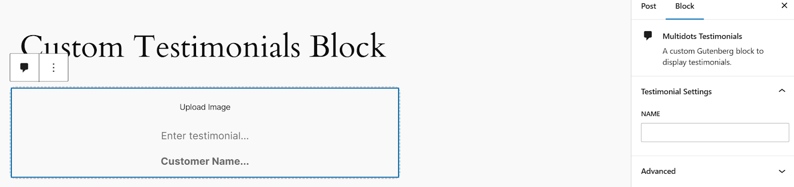
Custom Testimonials block in the editor
Note the Testimonial Settings panel in the sidebar with the NAME TextControl input. Add the content, publish your post, and see how it appears on the frontend.
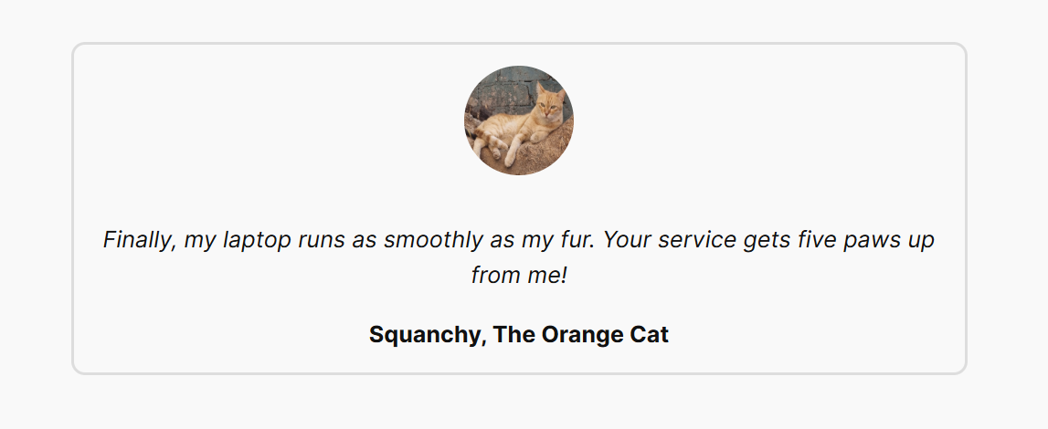
Custom testimonials block on the frontend
Although the block’s styling is pretty basic, you’ve learned the gist of it. Use different supports and styles to refine your testimonials block further.
#2 Pricing Table Block
Let’s create a custom pricing table block to showcase your product or service offerings.
As always, we’ll begin the custom block development process by scaffolding the block plugin with the create-block tool.
npx @wordpress/create-block multidots-testimonialsAfter scaffolding the block plugin, activate it in your WordPress dashboard. Then, run the npm start command in your terminal to start the build process when you make changes automatically.
Start the development process by editing the block.json file:
"apiVersion": 3,
"name": "create-block/multidots-pricing",
"version": "0.1.0",
"title": "Multidots Pricing Table",
"category": "widgets",
"icon": "editor-table",
"description": "A custom Gutenberg block to insert a pricing table.",
"keywords": [
"multidots",
"pricing",
"table",
"comparison"
],
"example": {},
"supports": {
"html": true,
"shadow": true,
"align": true,
"color": {},
"spacing": {
"margin": true,
"padding": true
},
"align": true,
"__experimentalBorder": {
"color": true,
"radius": true,
"style": true,
"width": true
}
},
"attributes": {},
"textdomain": "multidots-pricing",
"editorScript": "file:./index.js",
"editorStyle": "file:./index.css",
"style": "file:./style-index.css",
"viewScript": "file:./view.js"
}
Change the icon and description values, then add keywords and supports. We’ll use the InnerBlocks component to build this block, so we don’t need any attributes, as the core blocks will take care of that.
Next, open the edit.js code and build the edit() function after importing the InnerBlocks component.
import { useBlockProps, InnerBlocks } from '@wordpress/block-editor';

export default function Edit({ attributes }) {
const ALLOWED_BLOCKS = ['core/heading', 'core/paragraph', 'core/button'];
const PRICING_TEMPLATE = [
['core/heading', { level: 2, placeholder: __('Plan Name', 'multidots-pricing') }],
['core/heading', { level: 3, placeholder: __('$99', 'multidots-pricing') }],
['core/paragraph', { placeholder: __('Plan details go here...', 'multidots-pricing') }],
['core/button', { url: '#', placeholder: __('Buy Plan!', 'multidots-pricing') }]
];
return (
<div {...useBlockProps({ className: 'pricing-table-block' })}>
<InnerBlocks allowedBlocks={ALLOWED_BLOCKS} template={PRICING_TEMPLATE} templateLock="all" />
</div>
);
}
We used the same logic when building the custom testimonials block, except there’s only one column here. You’ll see how we converted that to multiple columns inside the editor.
We then move to the save.js file and build the render function for the frontend.
import { useBlockProps, InnerBlocks } from '@wordpress/block-editor';

export default function save({ attributes }) {
return (
<div {...useBlockProps.save({ className: 'pricing-table-block' })}>
<InnerBlocks.Content />
</div>
);
}
The above code is straightforward.
Lastly, you add the following styles to your styles.scss file:
.pricing-table-block {
background: #ffffff;
padding: 20px;
border-radius: 10px;
text-align: center;
box-shadow: 0 4px 6px rgba(0, 0, 0, 0.1);
}
Now, refresh your WordPress editor and insert the pricing table block.
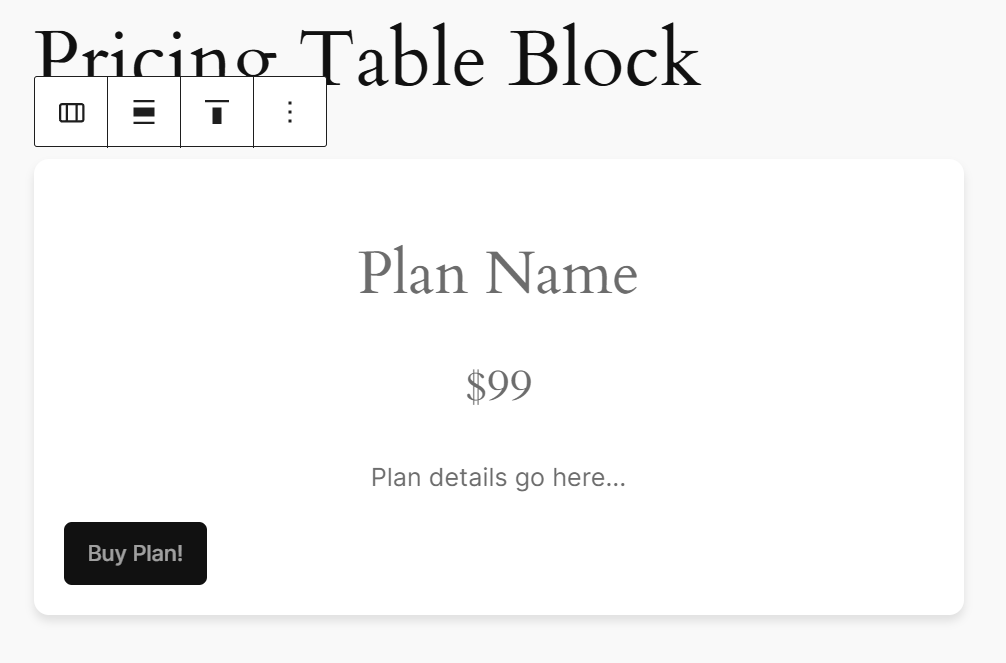
The custom pricing table block
After inserting the block, click on the leftmost icon in the block toolbar to transform the block into a Columns group.
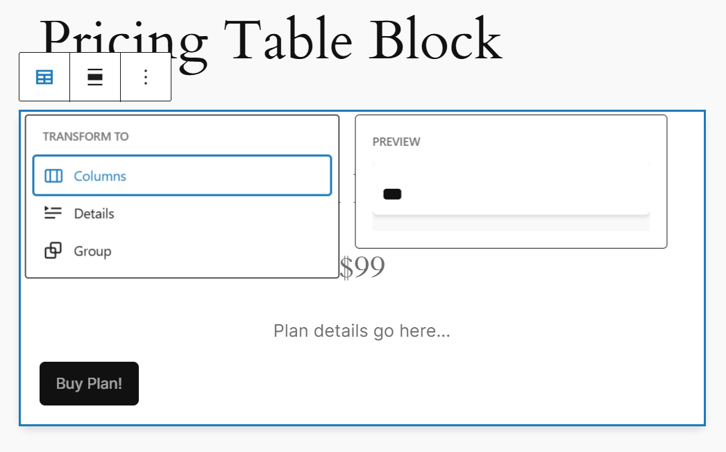
Transforming the block to a Columns group block
Now, you can add as many columns as required and duplicate the pricing table block for each column. Let’s add three columns to demonstrate how it works.
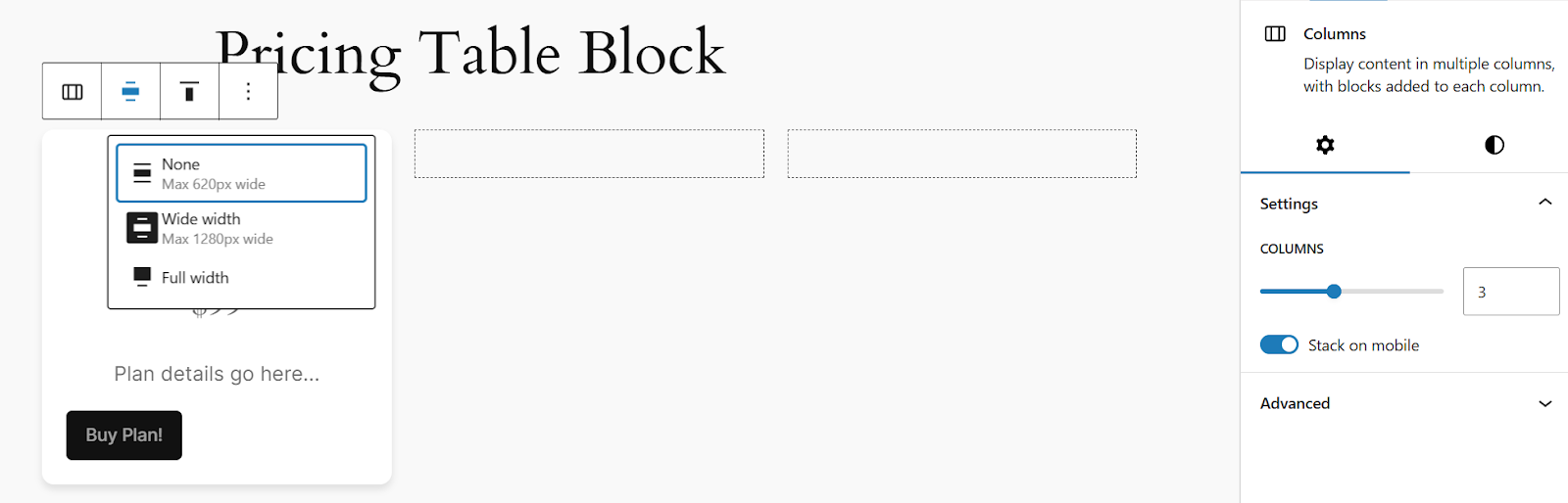
Setting the number of columns in the Inspector Panel
While at it, set the alignment setting to Wide width.
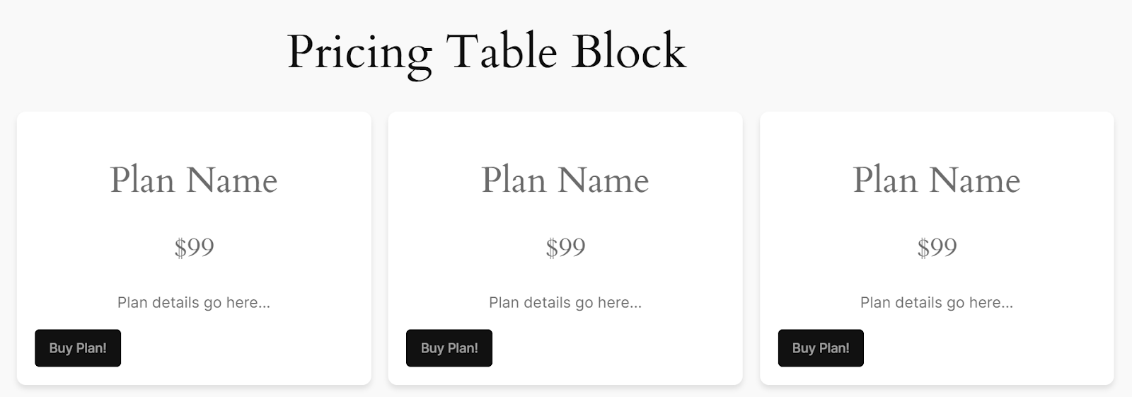
Duplicated pricing table blocks in each column
The pricing table is now complete. Add the plan names, prices, descriptions, and button links. Format each nested block using its sidebar settings, adding text and background colors, borders, shadows, etc.
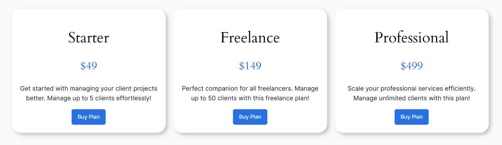
The final look of our pricing table block
You’ve now successfully created the pricing table block. You can further improve it by tweaking its design and adding additional features.
If you’re looking for more ideas for developing custom blocks, here are a few more:
- FAQs Accordion Block
- Progress Bar Block
- Team Members Block
- Countdown Timer Block
- Portfolio Grid Block
- Progress Bar Block
- Ratings Block
- Social Media Links Block
Custom Gutenberg Blocks Are a Powerful Tool
Unlike core WordPress blocks, you can use custom Gutenberg blocks to create unique layouts and interactions that align better with brand identity and user needs. They also enhance the functionality of the WordPress editor and help you create custom-tailored experiences for yourself and your clients.
You learned how to develop them in this extensive step-by-step tutorial. However, this is just the beginning!
You can do much more with custom blocks. For instance, you can add style variations to let users choose between multiple block styles with just a single block. If you’re updating a block often, you can introduce block deprecations so that already live blocks don’t break after an update. Then, there are dynamic blocks to render blocks in real-time and much more.
Want to unlock the full potential of WordPress with tailored Gutenberg solutions built for your business? Let’s Talk!
Schedule a consultation call and discuss your migration requirements.
Contact Us
